> Essential Components for a Visual Brand Identity
A good visual identity is one that accurately represents the values and personality of a brand. It should be unique and easily recognisable, allowing customers to easily identify and remember the brand. A good visual identity should also be versatile, and able to be applied across a range of mediums and formats while still maintaining its integrity and impact. It is important to consider factors such as colour, typography, and imagery when creating a visual identity, as each of these elements can have a significant impact on how a brand is perceived. Ultimately, a good visual identity should be visually appealing, memorable, and communicate the essence of the brand in a way that resonates with its target audience.
These are the most essential elements to incorporate into your visual identity
* Logo

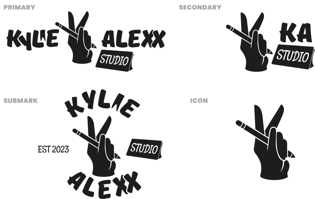
Your initial objective is to create a logo that is both robust and adaptable to match your brand’s personality, as well as simple to use across various applications. Here are a few different types of logo variations:
Primary logo: Your primary logo serves as the face of your brand. It is the most prominent design, and all other logos should be derived from it. Typically displayed in a horizontal format, primary logos are the most detailed and comprehensive of all brand designs. They incorporate taglines, established dates, illustrations, icons, locations, or any other crucial aspects of your brand. However, the intricacies and size of a primary logo require ample space to be displayed effectively. Use your primary logo in areas that provide enough room for it to shine and command attention. Some ideal placements for primary logos include the desktop website header and large print collateral such as signs.
Secondary logo: Secondary logos are simplified versions of primary logos used in specific contexts. They can be either vertical or horizontal and are typically focused on the brand name without any creative elements or taglines. Secondary logos are useful when the primary logo does not fit in a particular area, such as on clothing hang tags or smaller print materials. They can be used on various collateral pieces, including business cards and invoices.
Submark logo: Submark logos are small, simple designs that identify a brand when the larger logo variations can’t fit in condensed spaces. They can feature a complete business name with a creative element or just brand initials. Submark logos are versatile and creative and can be used in social media profile images, website footers, and mobile website headers.
Icon logo: A simplified version of the primary logo that often consists of a single element, such as a letter or symbol, and can be used as a favicon or in tight spaces.
Valuable Tips for Designing Your Logo
- Start with a black-and-white design to ensure that the logo is strong enough without the use of colors.
- Verify that the design will be effective for both web and print.
- Test the logo at smaller sizes to ensure it is still legible and recognisable.
* Colour palette

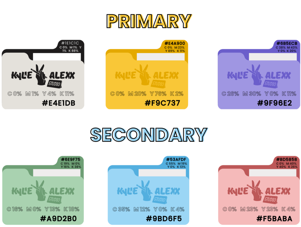
Colour is a powerful tool that can evoke emotions and set the tone for your designs. To make the most of this, it’s crucial to develop a simple yet versatile colour palette. This should offer enough options to work with without becoming overwhelming.
Colour theory is based on three primary colours: red, yellow, and blue. By combining primary colours, secondary colours can be created. The colour wheel represents the relationships between colours, with complementary, analogous, and monochromatic colour harmonies playing a crucial role in colour theory. Complementary colours create a bold contrast, analogous colours result in a more subtle, harmonious effect, and monochromatic colour schemes produce a calming effect using variations of tints, shades, and tones.
One approach to creating a colour palette is to start with a base colour and then choose complementary colours to create a harmonious scheme. Another approach is to choose colours based on their emotional associations – for example, warm colours like red and orange can evoke feelings of energy and excitement, while cooler colours like blue and green can create a sense of calm and relaxation.
Whatever approach you choose, it’s important to test your colour palette in different contexts to ensure that it works well in practice. By developing a strong and versatile colour palette, you can create designs that are both visually appealing and emotionally engaging.
Design Tips for Choosing Colors
Select one main colour and pair it with…
- Two primary colours
- Three to five complementary colours
- Two accent colours.
Ensure that the colours you choose will display accurately on the screen.
* Typography

Typography is a crucial element in design as it helps to convey the tone and message of your content. The right typography can captivate your audience and make your message more impactful. The pairing of fonts is important as it can create visual hierarchy and balance on a page. Headings and titles should be bold and eye-catching, while body text should be easy to read and not distract from the main message. Subheadings can be used to break up text and provide context. When choosing a font type, consider the style and tone of your content and the emotions you want to evoke. Serif fonts can convey a sense of tradition and elegance, while sans-serif fonts can feel modern and clean. The most important thing to keep in mind is to choose fonts that are legible and appropriate for your content.
Tips for Choosing Typography that Complements Your Brand
- Your logo’s shape and style should influence your typography choice for a complementary and cohesive look.
- Specify a primary, secondary, and tertiary typeface.
- Consider using a mixture of serif and sans-serif fonts.
- Test for legibility on both print and screen formats.
* Imagery

What is Brand Imagery?
Brand imagery encompasses the visual elements of your brand, including photos, videos, graphics, and any other visual content that represents your business. This includes everything from your website design to your social media posts to your advertising campaigns.
Why Do You Need Brand Imagery?
Strong, consistent brand imagery helps you build brand recognition and trust with your audience. When your imagery is consistent across all platforms, it helps customers recognise your brand and builds a sense of familiarity and trust.
How Do You Get Strong Brand Imagery?
The key to creating strong brand imagery is to have a clear understanding of your brand values and message. From there, you can choose visual elements that best represent your brand and create a consistent look and feel across all platforms. Consider working with a professional photographer or graphic designer to ensure your imagery is of high quality and aligns with your brand message.
Remember, your brand imagery should be consistent, high-quality, and reflective of your brand values and message. With a solid understanding of your brand and commitment to strong imagery, you can create a memorable, trusted brand that resonates with your audience.
In creating a visual identity, it is important to keep in mind the values and personality of the brand ensure that the identity is unique, and communicate the right message to your target audience. Contact me today and let’s develop a visual identity that truly represents the essence of your brand.