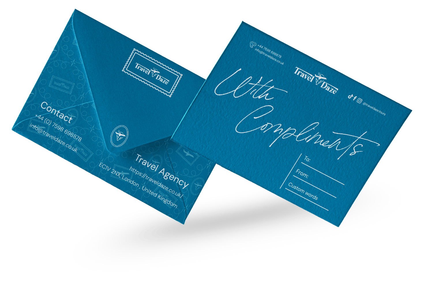
Branding & Visual Identity + Web design + Social Media
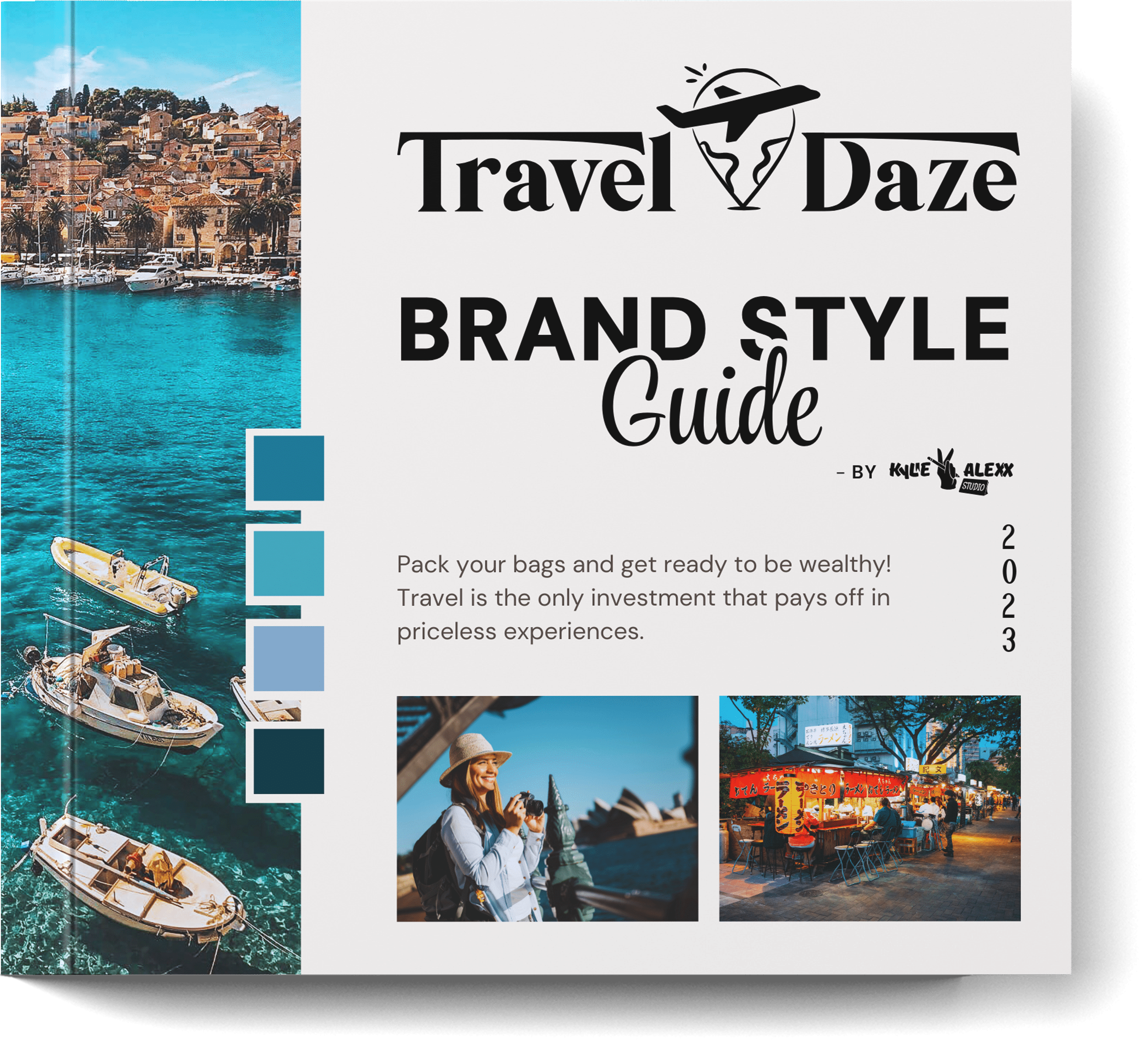
Travel Daze
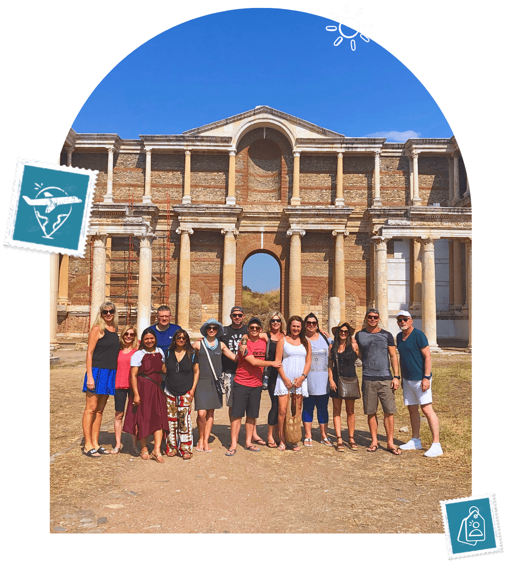
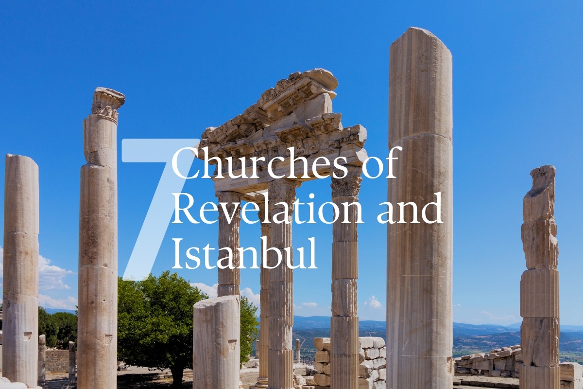
Travel Daze is a modern travel agency that specialises in customised tours for both groups and solo travellers. They have a strong passion for pilgrimage tours that are biblically focused, spiritually enriching, and offer experiences of diverse cultures that appeal to many travellers.
The client approached me to build a full visual identity and digital presence. They needed a brand that felt sophisticated yet welcoming, modern but rooted in experienced travel. The result is a visual identity and online impression that’s dreamy and intentional, a brand that invites you to explore with others, discover new favourite places, and travel with purpose.
35
Travel Daze covers over 14 countries and 35+ cities across Europe and Africa
65
Website engagement increases by over 65% after each tour launch
100
KylieAlexx built a 100% customisable Tour System for Travel Daze
“Travel Daze is a UK-based travel agency serving a niche market of customers with holiday journeys full of activities for solo and group travellers. We source the best hotels, cruises, guides and tour activities.
Our Travel Daze tours are registered on multiple B2C booking platforms that receive a global audience, which lets us achieve brand and product visibility. Our goal is to continue providing memorable tours and maintaining lifelong relationships with our travellers.” – TD CEO
01. Brand Overview
02. Logo System
––––Primary Logo
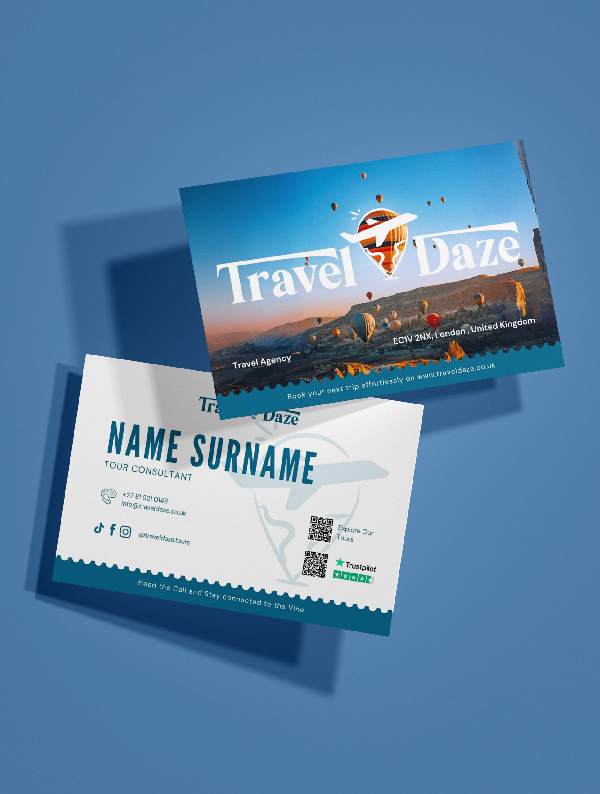
The primary logo combines elegant typography with a distinctive travel icon. The serif font (DM Serif Display) evokes trust, warmth, and timeless sophistication, while the custom icon communicates movement, exploration, and accessibility. This version communicates the full identity of Travel Daze with clarity and warmth.
This condensed version simplifies the brand name to “TD” while preserving the core iconography. It retains brand recognition in a more compact format, balancing professionalism and creativity.
✦ TD Social Media Icon: Set against a dreamy Cappadocia sky filled with hot air balloons, this icon captures the awe of travel and the joy of shared discovery.
The TD monogram, set in classic DM Serif Display, reinforces brand elegance and trust.
The central Travel Daze icon (location pin + aeroplane + globe squiggles) is seamlessly integrated into the letter “D”, grounding the symbol in purpose and movement.
– Designed For:
Profile pictures across Instagram, Facebook, TikTok, Threads, and beyond
Reels, Highlights, and pinned posts
Brand collabs, creator tags, or digital PR kits
– What It Communicates:
Adventure meets sophistication
Globally inspired, personally curated
Modern travel with a heart for connection
Use: Social Media profile image, watermarks and smaller applications
––––Logo Mark
The logo mark focuses entirely on the illustrated icon, instantly recognisable and rich in symbolism. It features:
A location pin: Rooted in destination-based experiences
Hand-drawn “land” squiggles: Represent the world’s diversity and personal discovery
An aeroplane: A universal symbol of travel
A “pop” accent: A playful spark that hints at joyful, family-friendly energy
Travel Daze uses a clear, versatile, and modern typeface system designed for both digital and print experiences. The combination of DM Serif Display and DM Sans reflects the brand’s balance between sophistication and approachability — ideal for travel that feels curated yet casual.
Logo Typeface: – DM Serif Display Used exclusively for the logo to convey a timeless, elegant personality with a strong, recognisable presence.
Primary Typeface: – DM Sans Suite A clean and contemporary sans-serif family is used throughout all brand communication for clarity and versatility.
Type Hierarchy:
H1 / Heading DM Sans Bold — 48pt Used for main headlines and section openers to create a strong visual impact.
H2 / Subheading DM Sans Italic — 20pt Used for secondary headings, captions, or short descriptions with emphasis and charm.
Body Copy DM Sans Regular — 16pt Applied across all standard paragraphs for optimal readability and flow.
Caption / Labels DM Sans Medium / Regular — 12pt Used in UI elements, icons, buttons, and smaller copy to provide structure and detail without distraction.
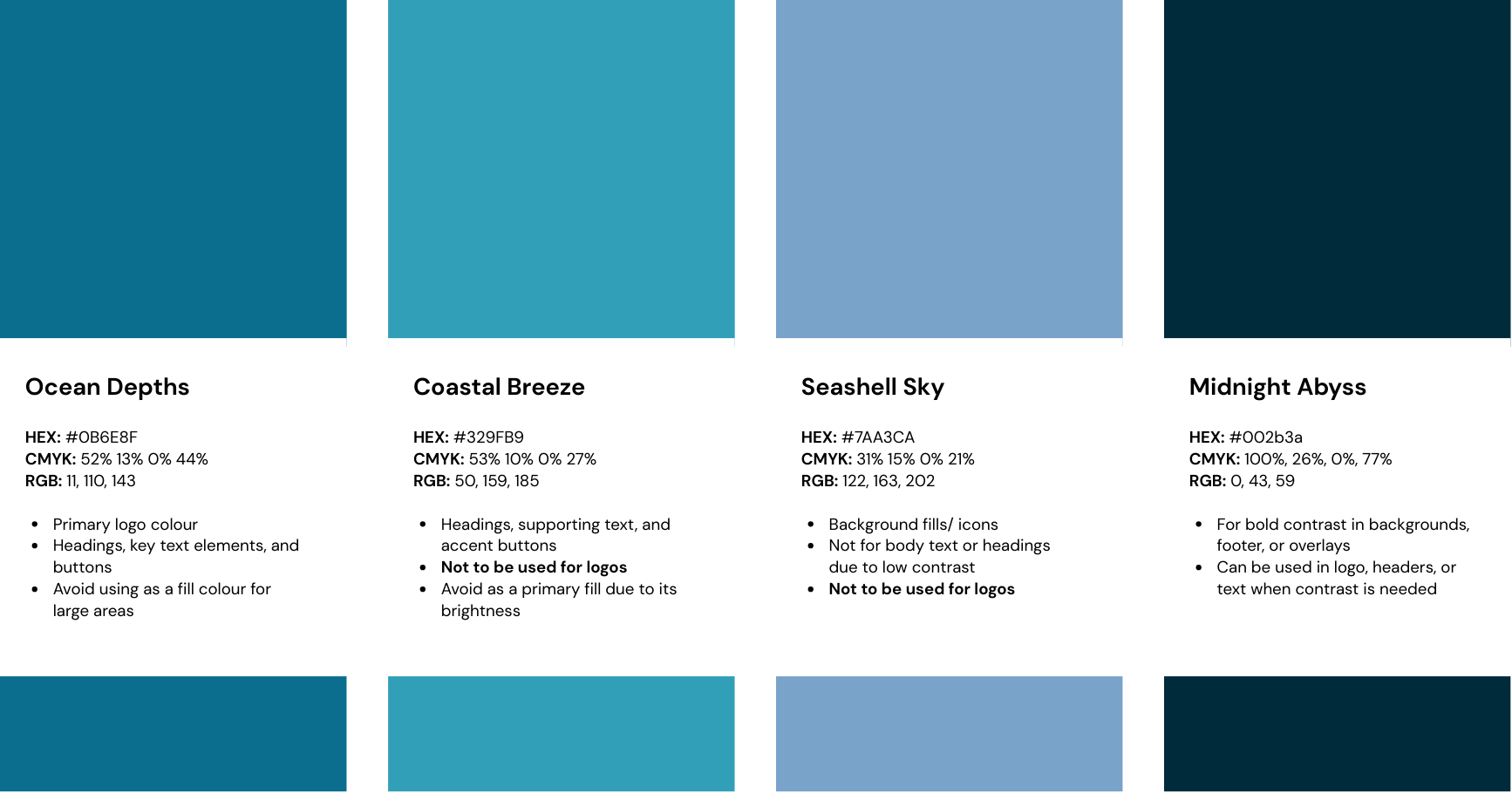
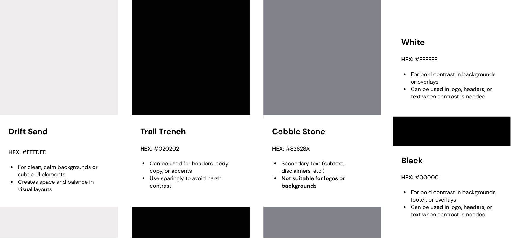
04. Colour Palette
The Travel Daze colour palette draws inspiration from the rich tones of deep oceans and bodies of water. This choice reflects the brand’s connection to travel while also conveying a sense of professionalism and elegance.
Each colour serves a specific function to maintain visual harmony and accessibility across digital and print formats.
Gradient – Costal Breeze to Ocean Depths
Gradient – Ocean Depths to Midnight Abyss
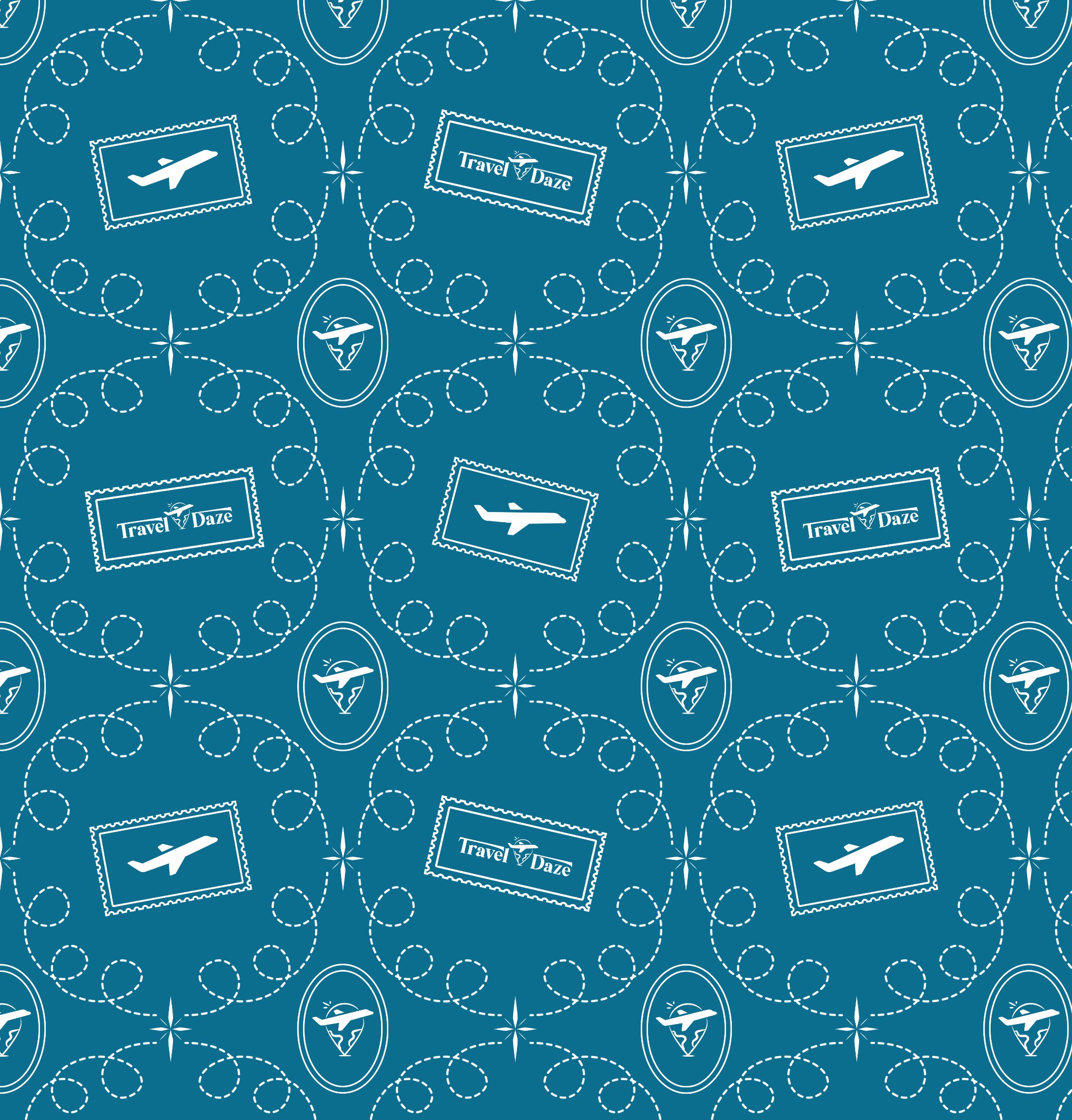
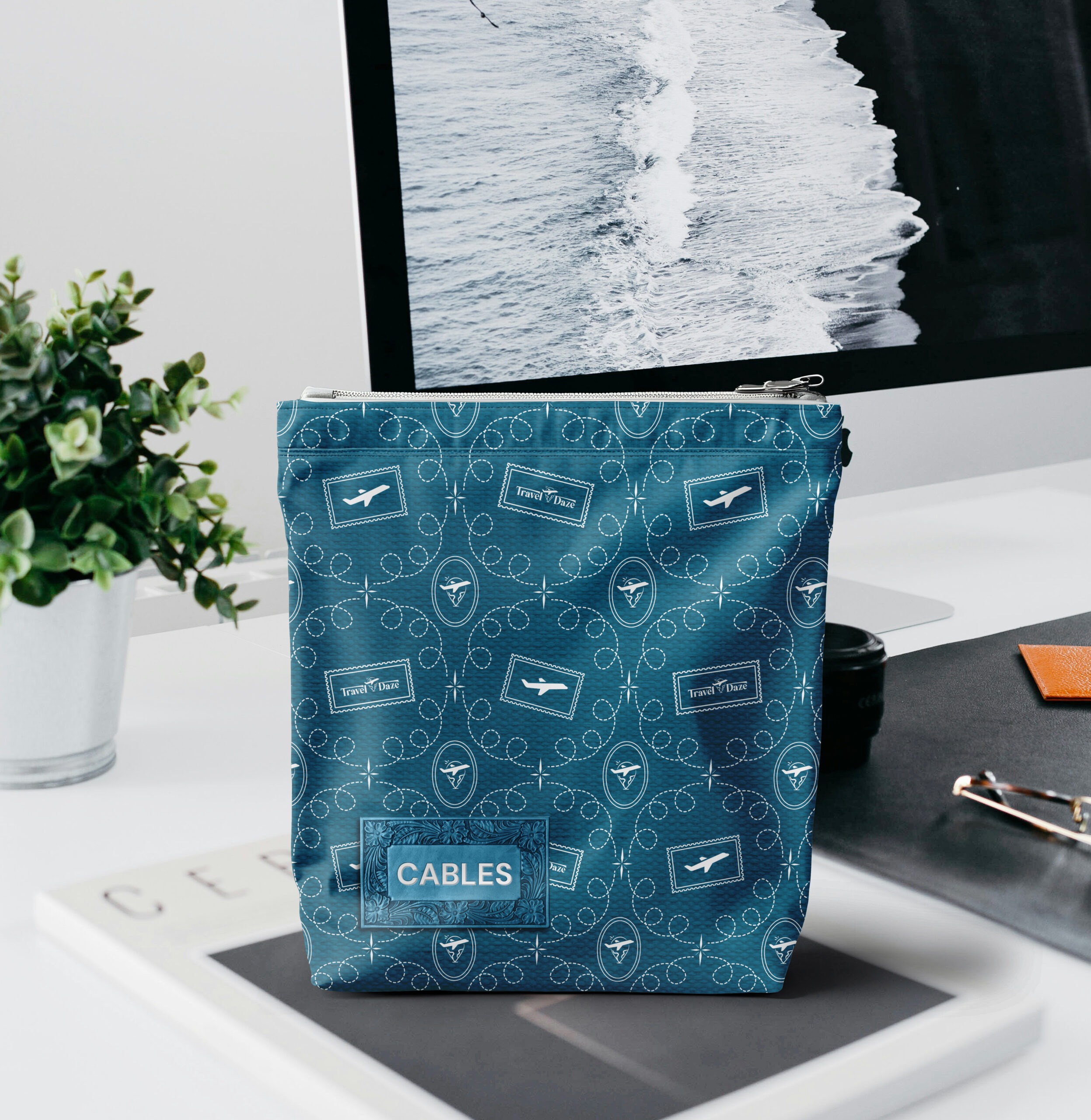
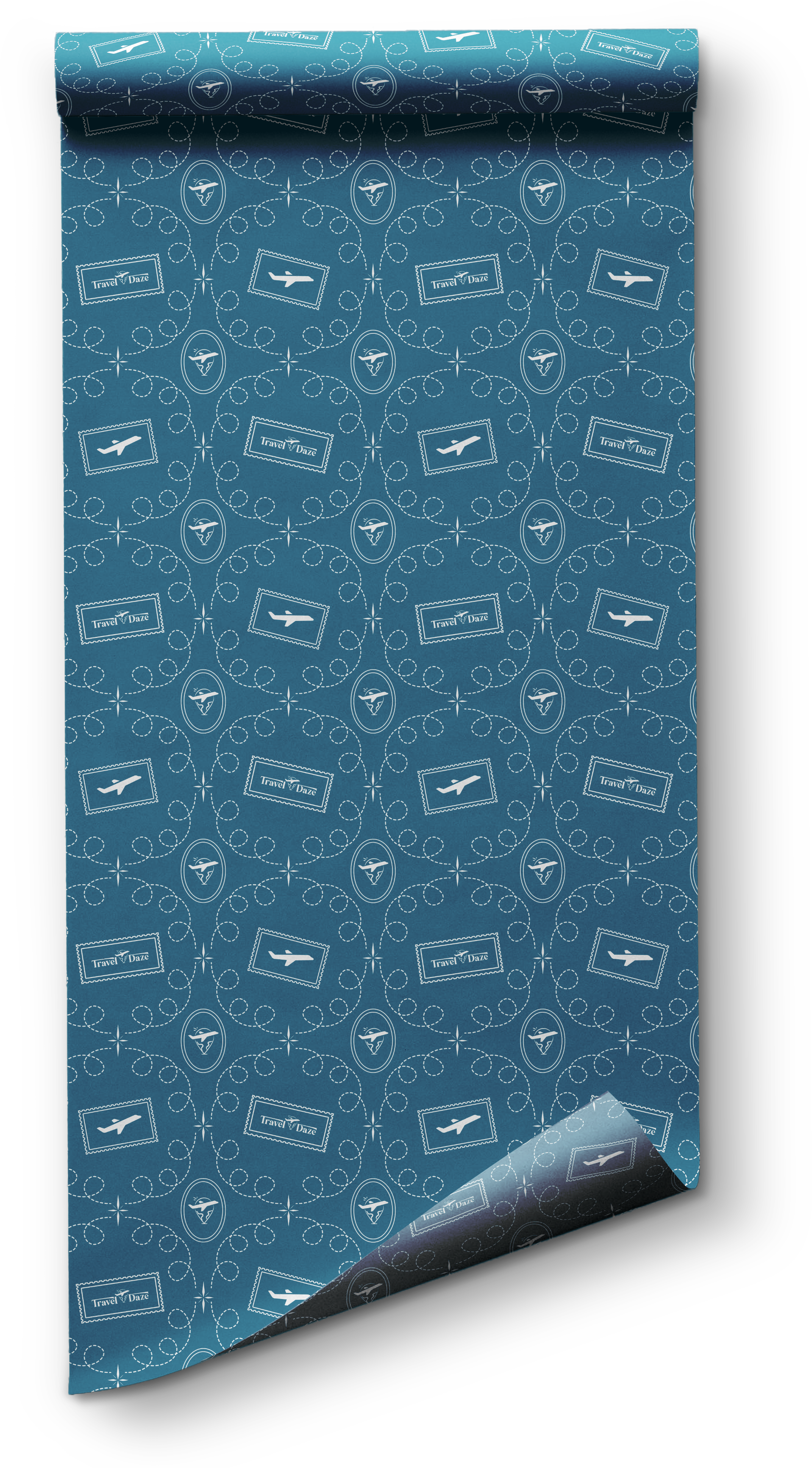
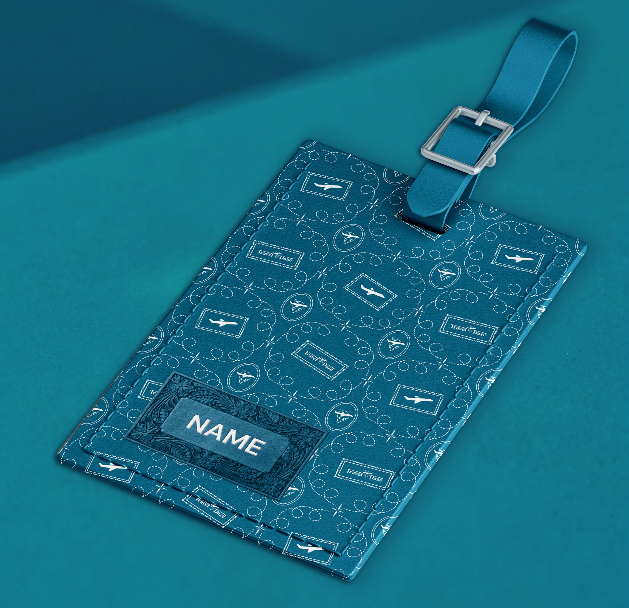
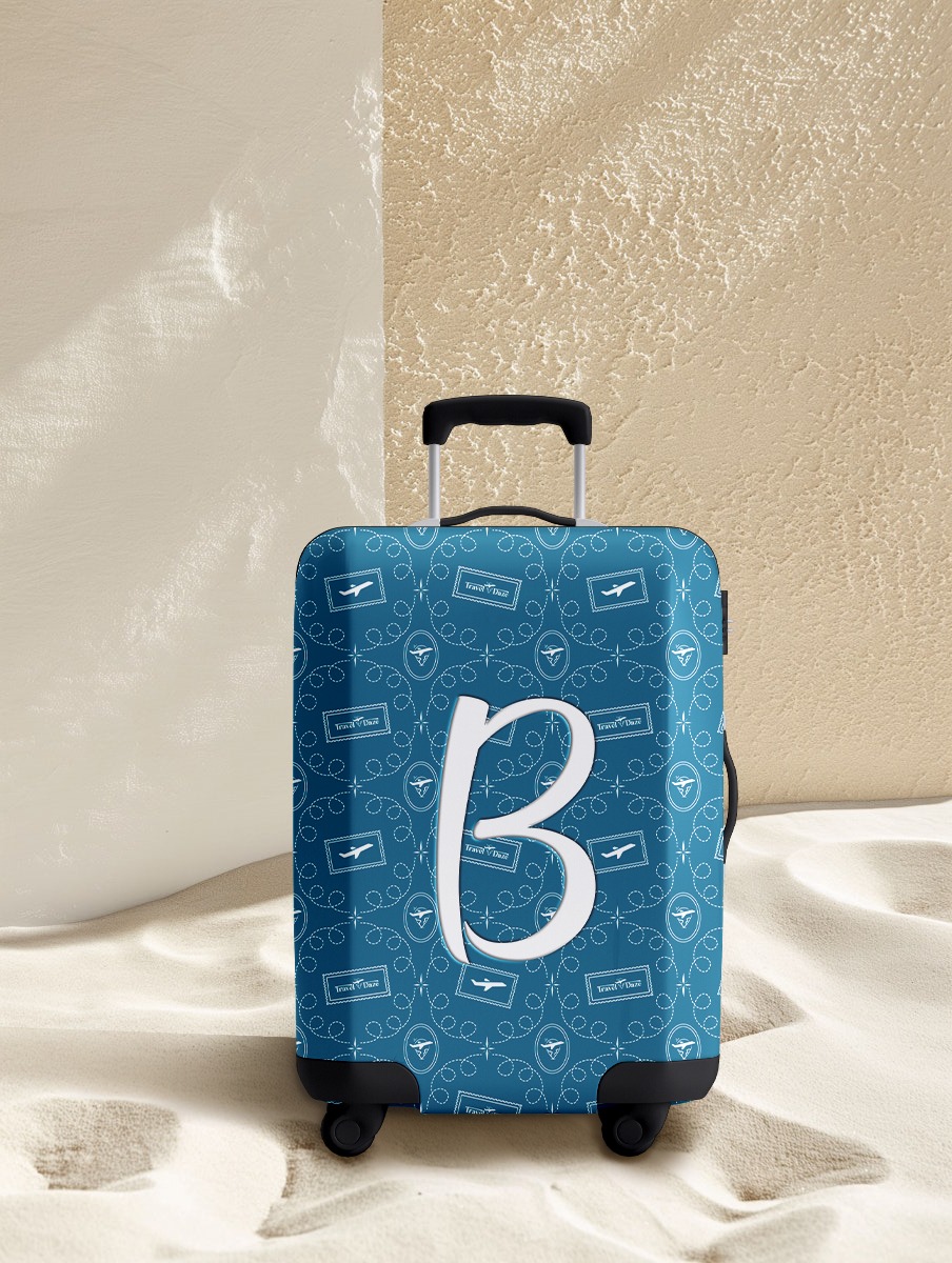
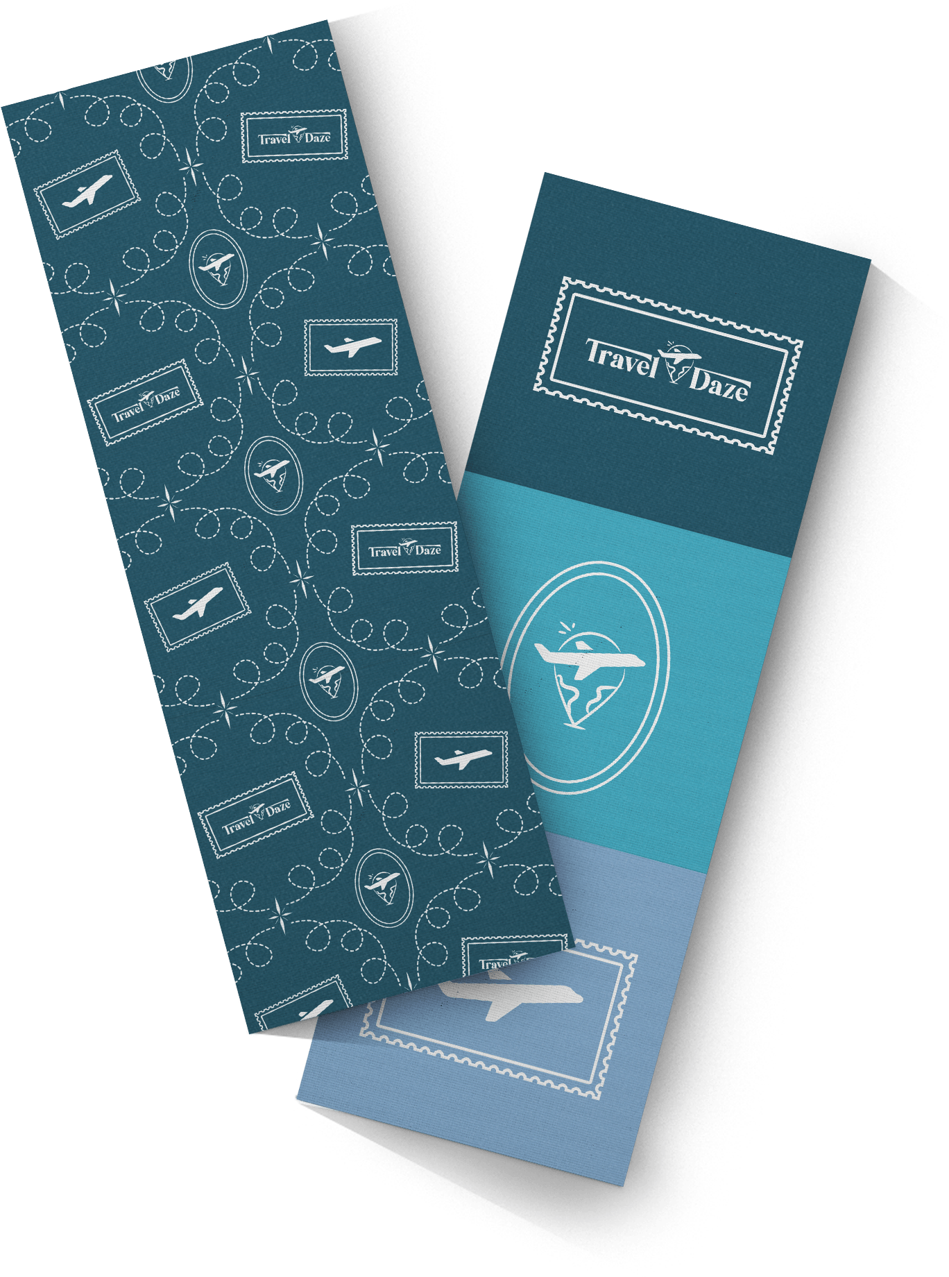
05. Pattern
–––– A Timeless Tapestry of Wanders
When TD CEO asked for something elegant, timeless, on-brand for TD’s marketing, and inspired by travel lines, we knew this pattern had to be more than just visually appealing, it had to “embody the delight and awe of the journey”.
Crafted with care and storytelling in mind:
Stitched flight paths bring movement and rhythm, subtle nods to the curated adventures TD is known for.
Postage stamp frames evoke a nostalgic sense of global discovery, the kind that creates core memories.
The TD icon and plane tie everything back to the heart of the brand — light, modern, and full of lift.
The repeating layout creates a seamless visual rhythm that feels both classic and current, just like Travel Daze. Each element, from loops to stars, is intentional, echoing the way every trip they design is handpicked and meaningful.
And when we presented it? “Nailed it to a T,” the CEO said — a stamp of approval for a design that’s ready to fly!!
This isn’t just a pattern. It’s TD’s story — elevated, elegant, and in perpetual motion.
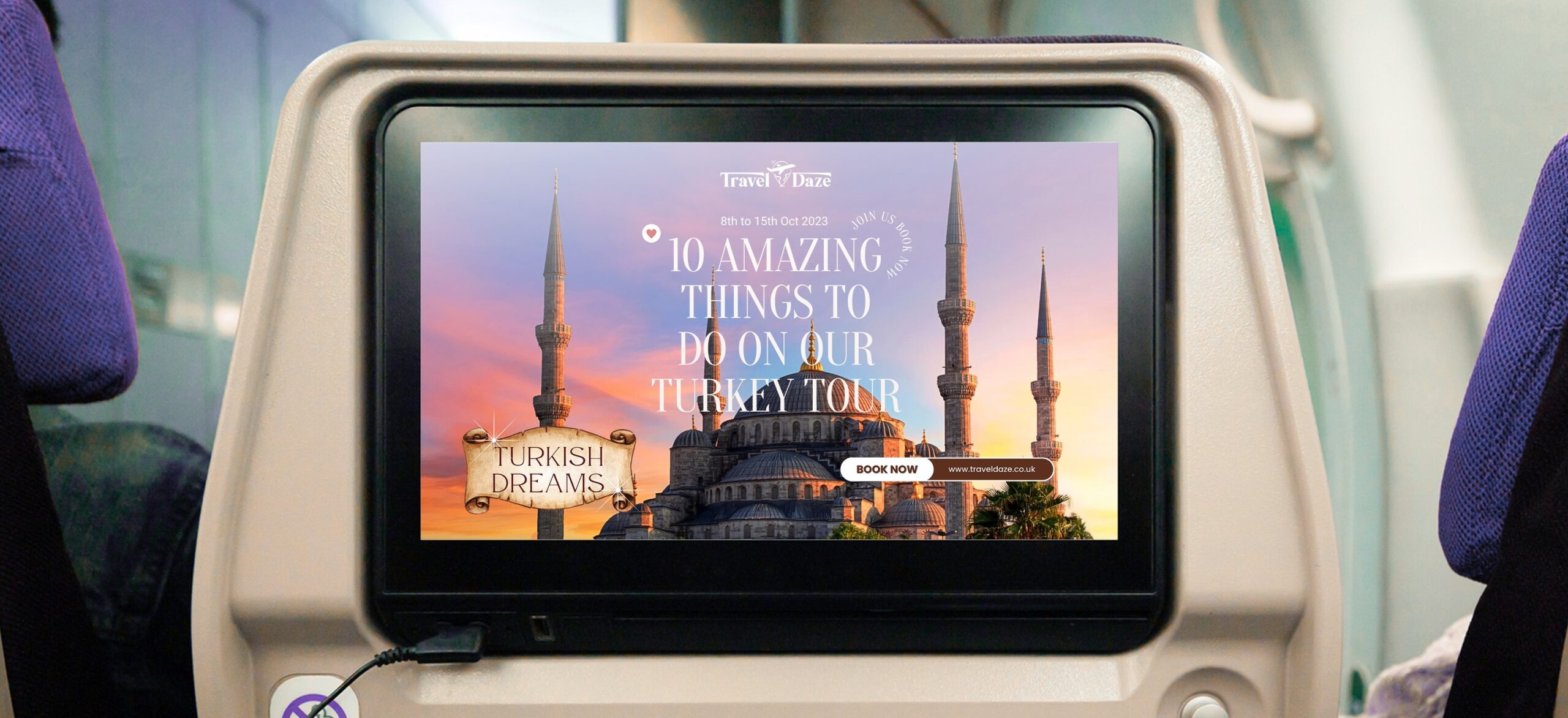
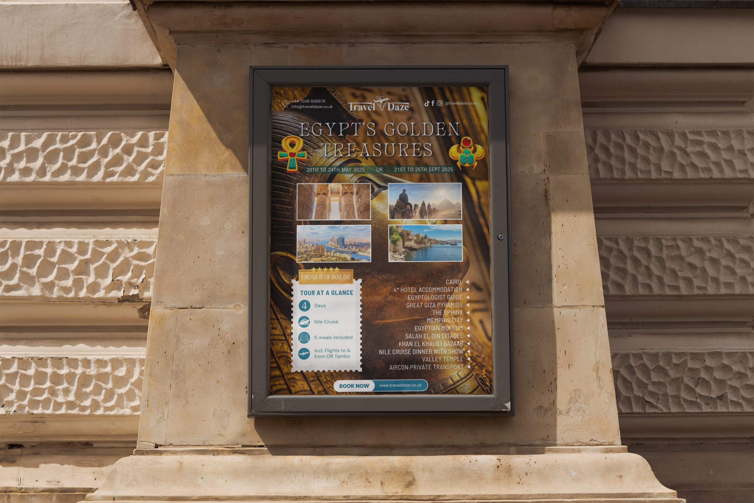
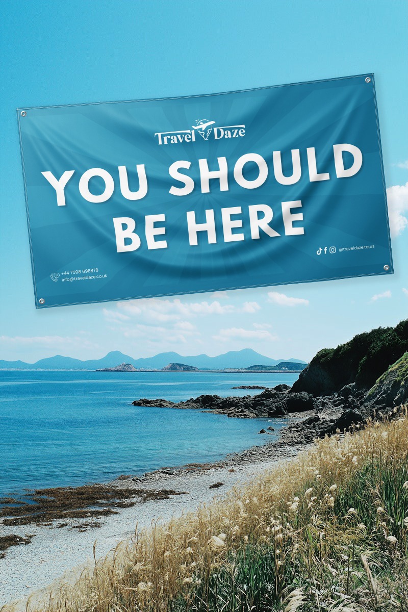
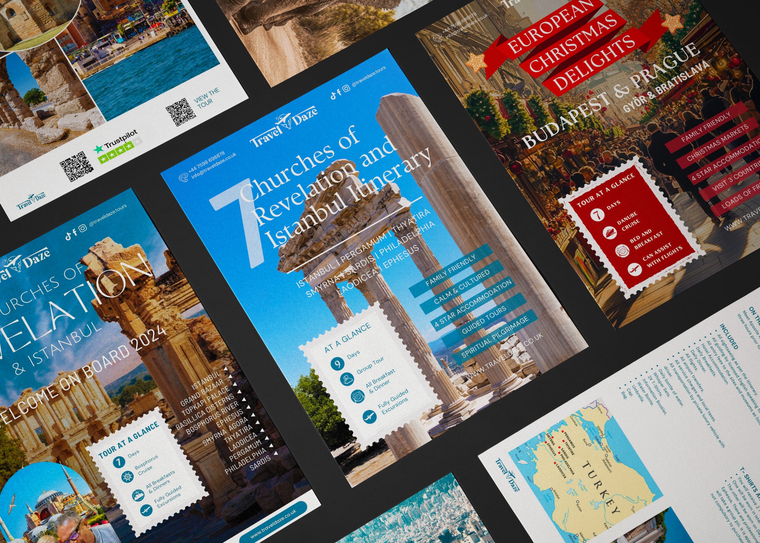
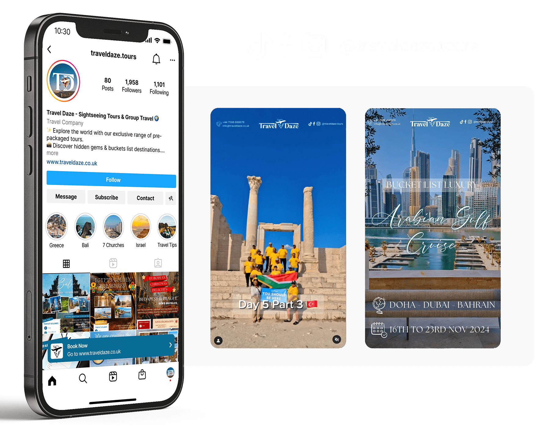
As part of Travel Daze’s brand and digital rollout, a series of curated, high-quality social media assets were created and published across Instagram, TikTok, and Facebook.
🎥 Video Content Creation
Tools: Adobe Premiere Pro & CapCut Style: Clean, cinematic edits with minimal transitions, subtle text animations, and curated soundtracks.
Content Types Produced:
✈️ Destination Teasers: Snappy reels showcasing key locations with text prompts to spark travellers’ interests.
📌 Behind the Scenes (BTS): Glimpses into TD’s tour days with daily video updates.
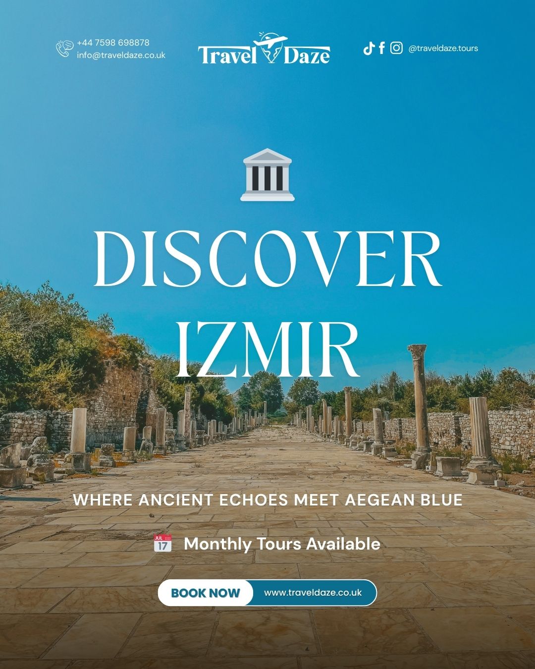
📸 Static Posts & Poster Designs
Tool: Canva Output:
🖼️ Tour Destination Posters (co-branded for tours with TD’s business partners)
✈️ Daily Tour Carousel posts (giving followers a peek into life on tour, things they’ll see and do)
🗓️ Specific TourCarousel Posts (sharing tour dates, what’s included, and call-to-actions for DM or link-in-bio booking)
Design Consistency: All posts followed the approved TD brand system:
Typography using DM Sans for text and fun heading fonts for each tour/post.
Colour Palette inspired by TD’s travel blues, each poster or post followed the brand palette with spacious blue sky for text backgrounds.
📆 Post Scheduling & Optimisation
Tool: Later.com
Pre-scheduled across all platforms to maintain posting consistency
Best posting times chosen using analytics from each platform
Hashtags, captions, and post copy written for maximum engagement + CTAs
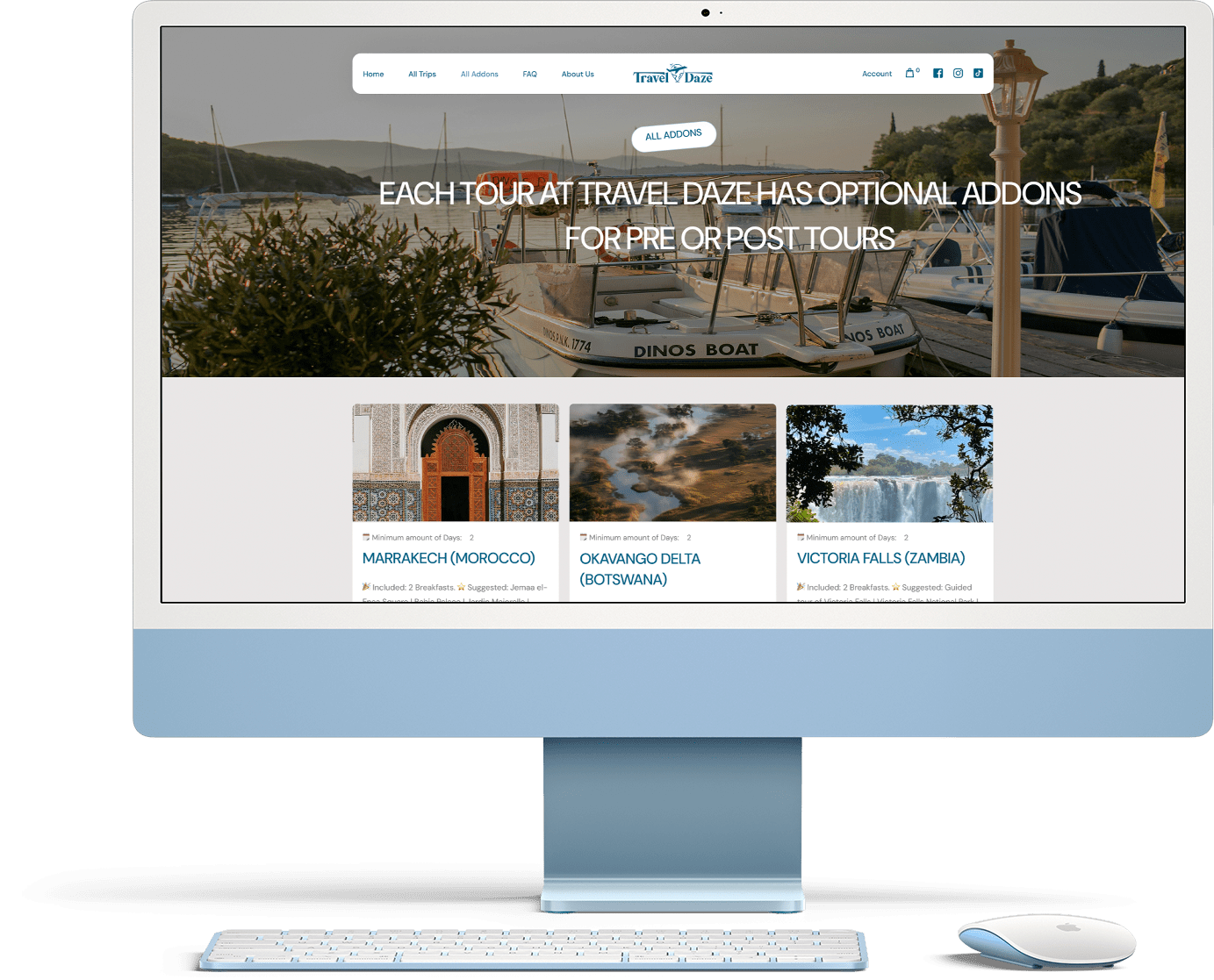
Platform: WordPress Tools Used: Advanced Custom Fields, Elementor, Envato Market, Figma (for design prototyping), Mail Poet for emails, and brute force protection. Years Active: The original site was launched in 2023, and it was fully redesigned and upgraded in 2025.
In 2023, Travel Daze approached me to design and build a custom WordPress website that would reflect the heart of their brand — approachable, curated group travel with an e-commerce touch. The initial site served as a digital home base for their growing catalogue of tours. Built with Advanced Custom Fields, each trip listing was structured for flexibility, allowing the team to easily add, edit, and manage itineraries with rich media, icons, and dynamic call-to-actions.
In 2025, with the brand’s visual identity solidified and the business scaling fast, I led a full website redesign and UX overhaul. The upgraded site includes:
A fully responsive interface with optimised mobile UX
Visual upgrades to reflect their new brand identity and colour system
A streamlined booking inquiry process
A blog and resource hub for travel tips
SEO-optimised custom pages
Enhanced tour filtering by destination, type of travel, and audience
Multi-platform integration (Mailchimp, Meta Pixel, Google Analytics)
The refreshed design creates an elevated user experience while still keeping navigation intuitive for all audiences — solo travellers, families, groups, and biblical scholars. With consistent branding across their entire digital presence, the new site has helped build trust and boost tour bookings.