Branding & Visual Identity
📘 Mathews With One T Consultancy
Mathews With One T is a bold, contemporary consultancy founded by career coach and strategist, Corin Mathews. The brand specialises in empowering individuals to take ownership of their career journeys through strategic planning, self-discovery, and practical tools. The client requested a brand identity that captured his unique personality, professional edge, and the standout nature of the consultancy’s name, “With One T”, which needed to be visually highlighted in a clean and clever way.
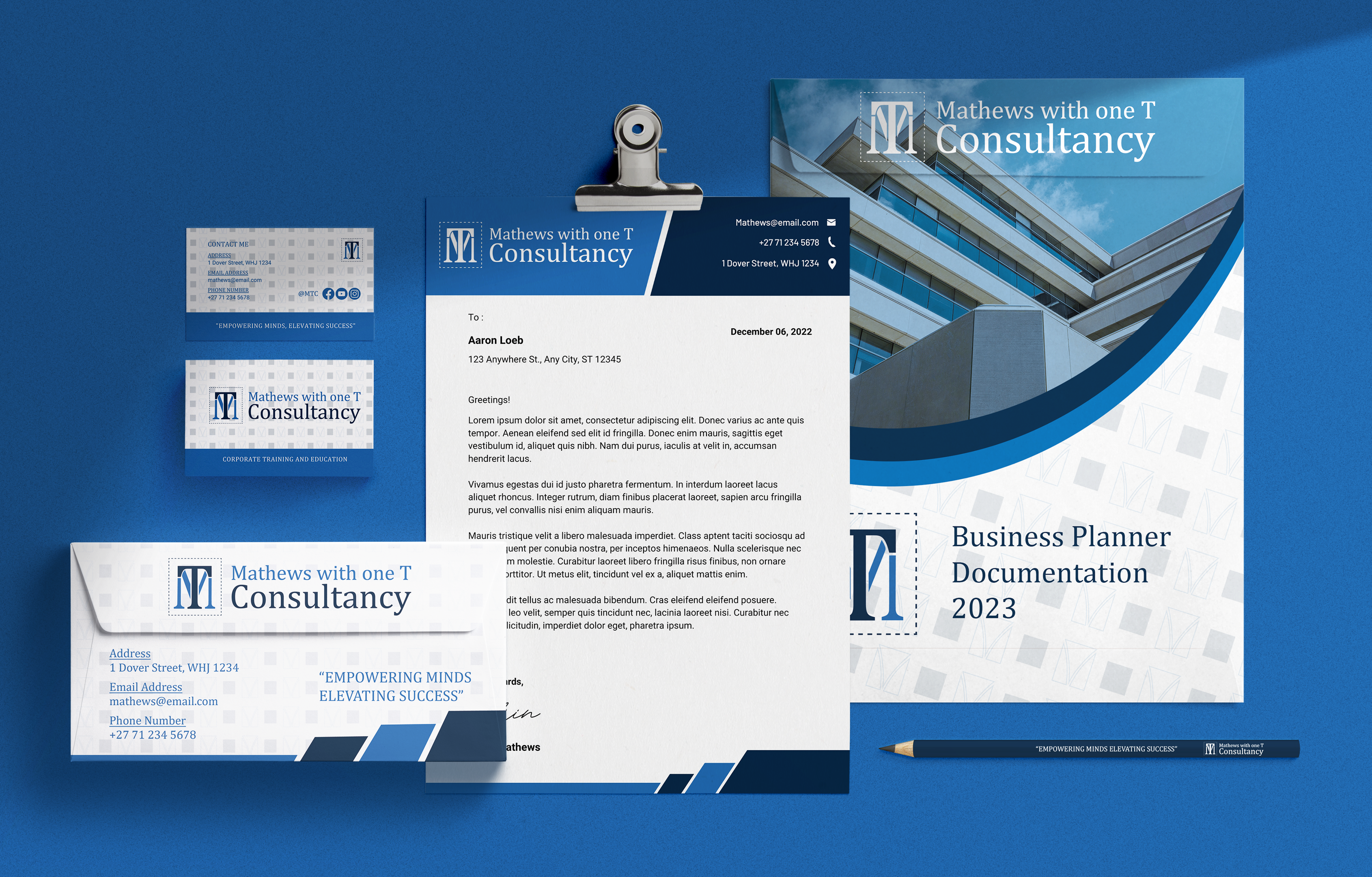

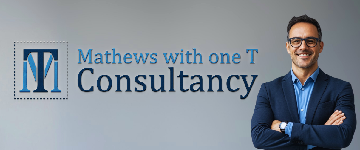
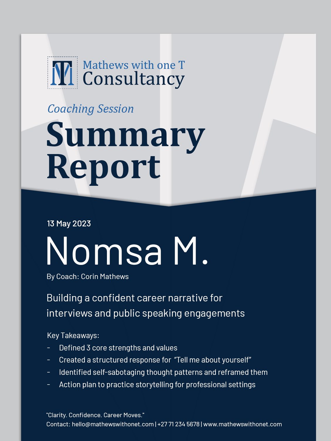
Mathews With One T is a strategic career consultancy focused on helping professionals navigate change, take charge of their futures, and make confident career moves. Founded by Corin Mathews, the brand plays on the uniqueness of his name, “with one T”, and builds its identity around clarity, bold thinking, and personal empowerment.
01. Brand Overview
Headquarters
Johannesburg, South Africa
Industry
Business & Career Consulting
Slogan
“Empowering Minds, Elevating Success”
Brand Values
-
Simplicity with impact
-
Strategic insight
-
Personal empowerment
-
Professional excellence
Brand Personality
-
Bold, but approachable
-
Clever and clean
-
Confident and professional
-
Warm, yet assertive
02. Logo System
Primary Logo
The primary logo is a clean typographic treatment with subtle visual cues to emphasize the “One T” concept. The “T” becomes a hero element through spacing and alignment.


Full wordmark (horizontal)
The full logo with emblem and wordmark side by side, ideal for website headers, documents, and brand presentations.

Stacked Logo
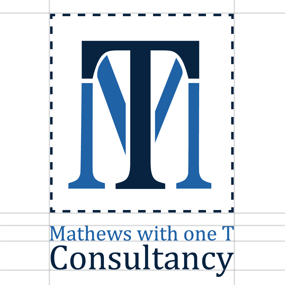
A vertical version with the emblem on top and the wordmark below, used for social banners, mobile layouts, and limited-width spaces.

Icon Mark
The standalone emblem used for favicons, social media avatars, and minimalist branding where space is limited.

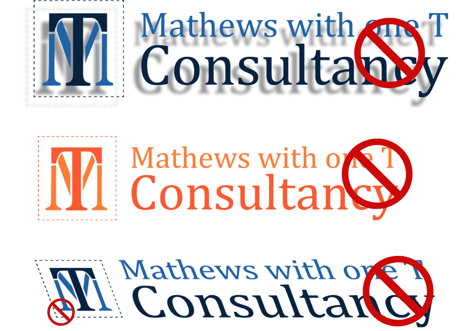
Incorrect Usage
- Avoid using drop shadows or outlines
Do not stretch or skew the logo
Do not change logo colours
- Do not change the size of the emblem in both the full wordmark and the stacked logo
03. Typography

Primary Typeface: Cambria
Elegant, classic, and confident — used for headings, titles, and emphasis. Reflects the brand’s professionalism and authority.
Examples:
H1 / Heading:Cambria Bold — 48pt
H2 / Subheading:Cambria Italic — 22pt
Body Typeface: Barlow
Modern, clean, and easy to read — used for paragraphs, captions, and supporting text. Balances tradition with approachability.
Examples:
Body Copy:Barlow Regular — 16pt
Caption / Labels:Barlow Medium — 12pt
04. Colour Palette
Primary & Secondary Colours
Use Case:
– Clarity Blue for highlights, links, and visual pop.
– Deep Insight anchors the brand in professionalism.
– Soft Charcoal supports clean readability.
– Ivory Mist keeps the brand approachable and minimal.
Clarity BlueHEX: #1F62A6
A calm, light blue representing trust, clarity, and forward-thinking guidance.
Deep InsightHEX: #072340
A dark, grounded navy symbolising authority and deep sense of stability.
Soft CharcoalHEX: #333333
Modern and neutral, used for body text and subtle accents to maintain balance.
Ivory MistHEX: #F7F7F5
A soft, white for creating space, contrast, and warmth in layouts.

Gradient

Logo Colour Rules
Primary Palette
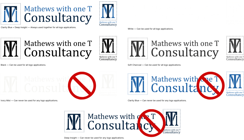
All logo variations must use a combination of Clarity Blue (#1F62A6) and Deep Insight (#072340). These two colours should always appear together to maintain brand consistency and visual balance.
Usage Guidelines
✅ Clarity Blue + Deep Insight — Always used together for all primary logo applications.
✅ Soft Charcoal (
#333333) — Permitted in contexts where enhanced legibility or minimalist styling is required.✅ White (
#FFFFFF) or Pure Black (#000000) — Allowed only when applying the logo to dark or light backgrounds for maximum contrast.
Restrictions
❌ Do not use Clarity Blue or Deep Insight alone in any logo variation.
❌ Never use Ivory Mist (
#F7F7F5) as a logo colour. It is reserved for backgrounds and negative space only.
05. Pattern
Pattern Breakdown
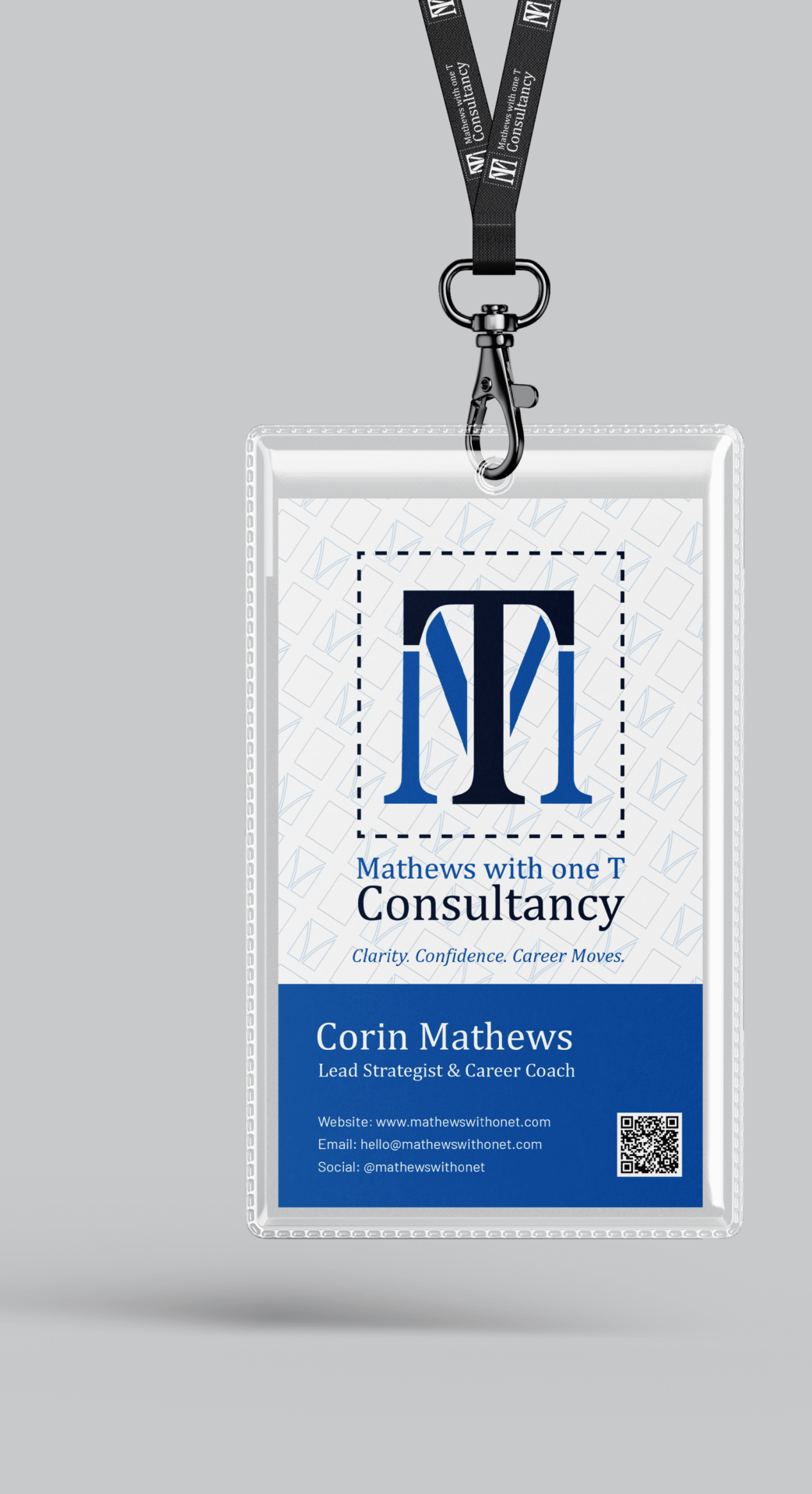
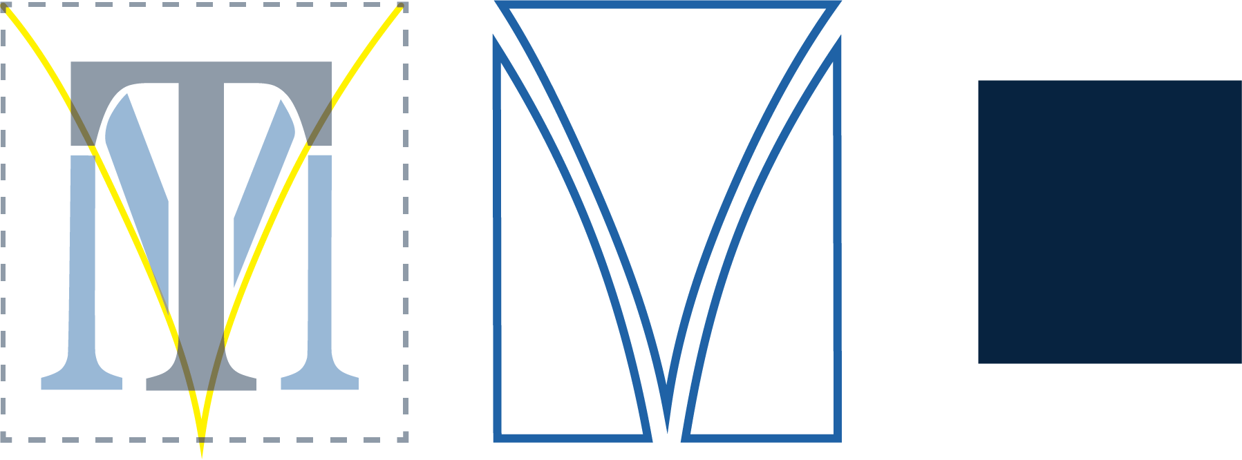
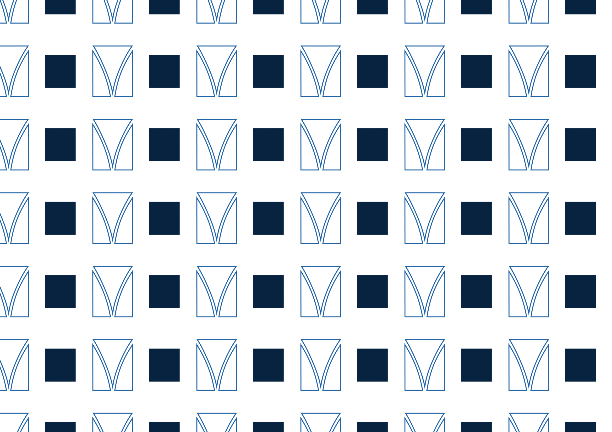
The design features individual illustrated elements arranged into a seamless, repeating composition, creating a cohesive pattern for textiles, packaging, or digital backgrounds.
06. Applications
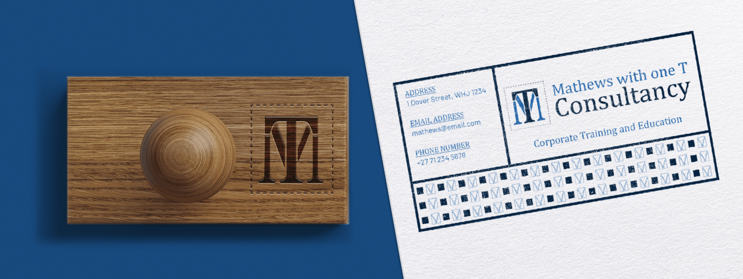
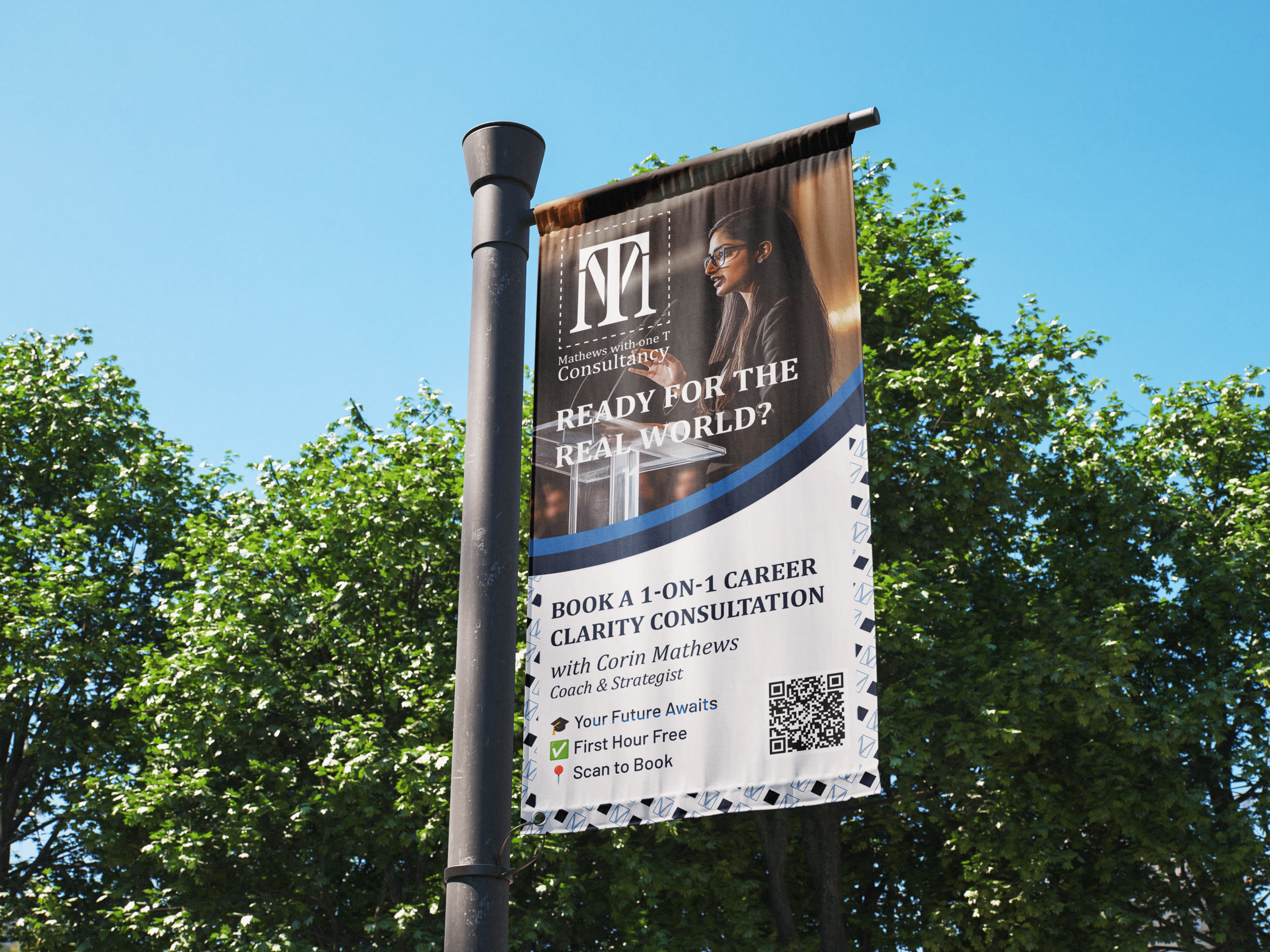
Contact & Credits
Client: Mathews With One T Consultancy
Design Studio: KylieAlexx Studio
Artist: Kylie Alexander
Year: 2023
Behance Link: Click Here
🛠️ Apps Used
Adobe Illustrator – Logo design, icon development, and brand system creation
Adobe Photoshop – Mockups, image enhancement, and brand visuals
Figma – Brand book layout, wireframes, and responsive digital assets
Notion – Client brief, feedback tracking, and project planning
Google Docs – Copywriting, brand messaging, and collaborative editing
Behance – Final case study presentation and project showcase
