Veldt is a minimalist skincare brand rooted in the open landscape of the South African highveld. Built for consumers who reject filler ingredients and overcrowded shelves, Veldt needed every touchpoint from the logo to the checkout page to communicate premium quality before a word was read.
Brand Strategy · Logo System · Colour & Type · Packaging · Brand Guidelines · Shopify Storefront · Product Page Architecture · Mobile-First Responsive Design · Launch Campaign · Social Content System · Email Campaign · Paid Ad Templates
A DTC skincare brand targeting conscious premium consumers needed a market-defining identity, a Shopify storefront optimised for conversion and a launch campaign that could earn shelf space in premium retailers from day one.
Where most skincare brands promise transformation, Veldt promises simplicity, back to skin that works without being overwhelmed. Their USP is radical ingredient transparency paired with visual restraint that signals quality instantly.
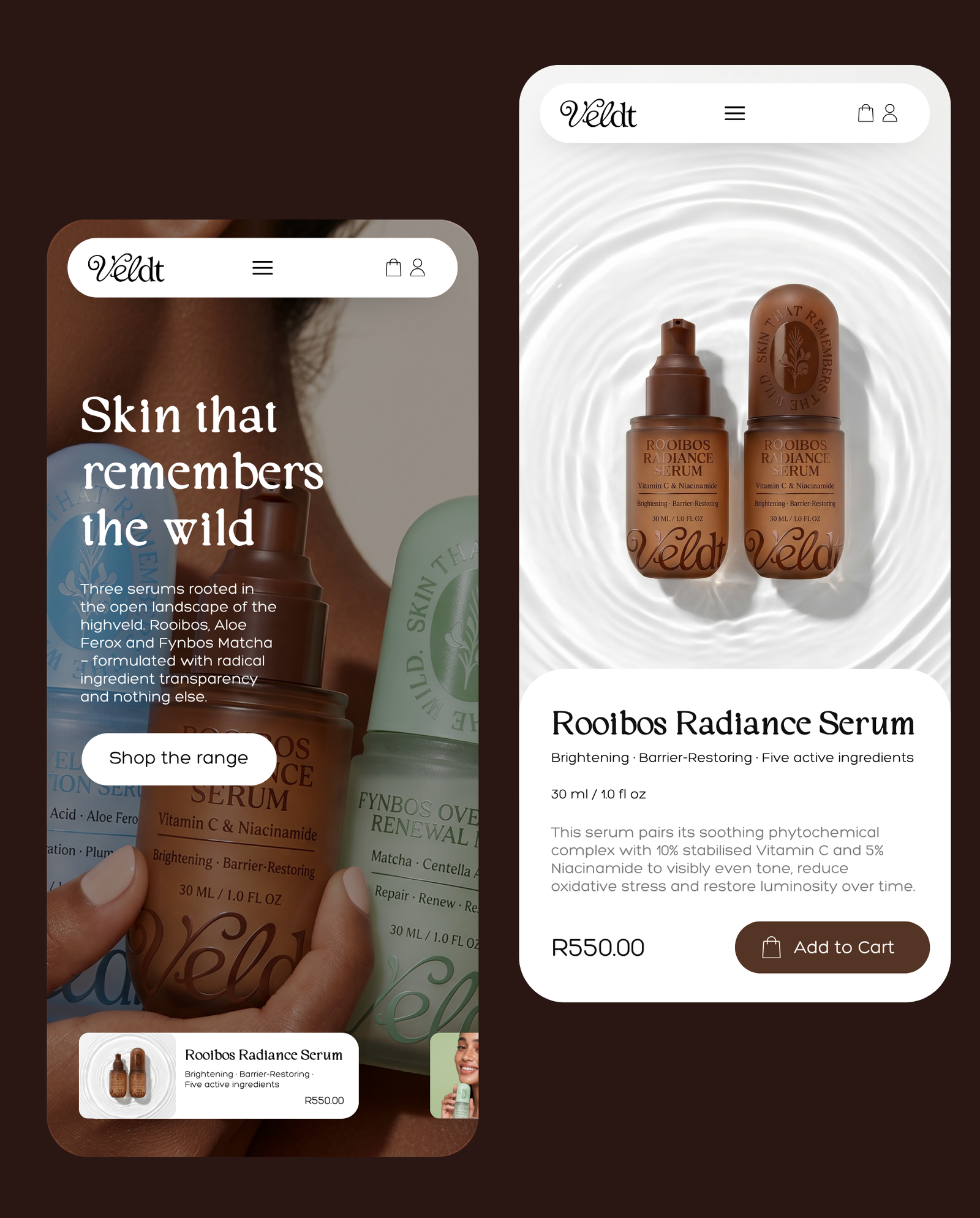
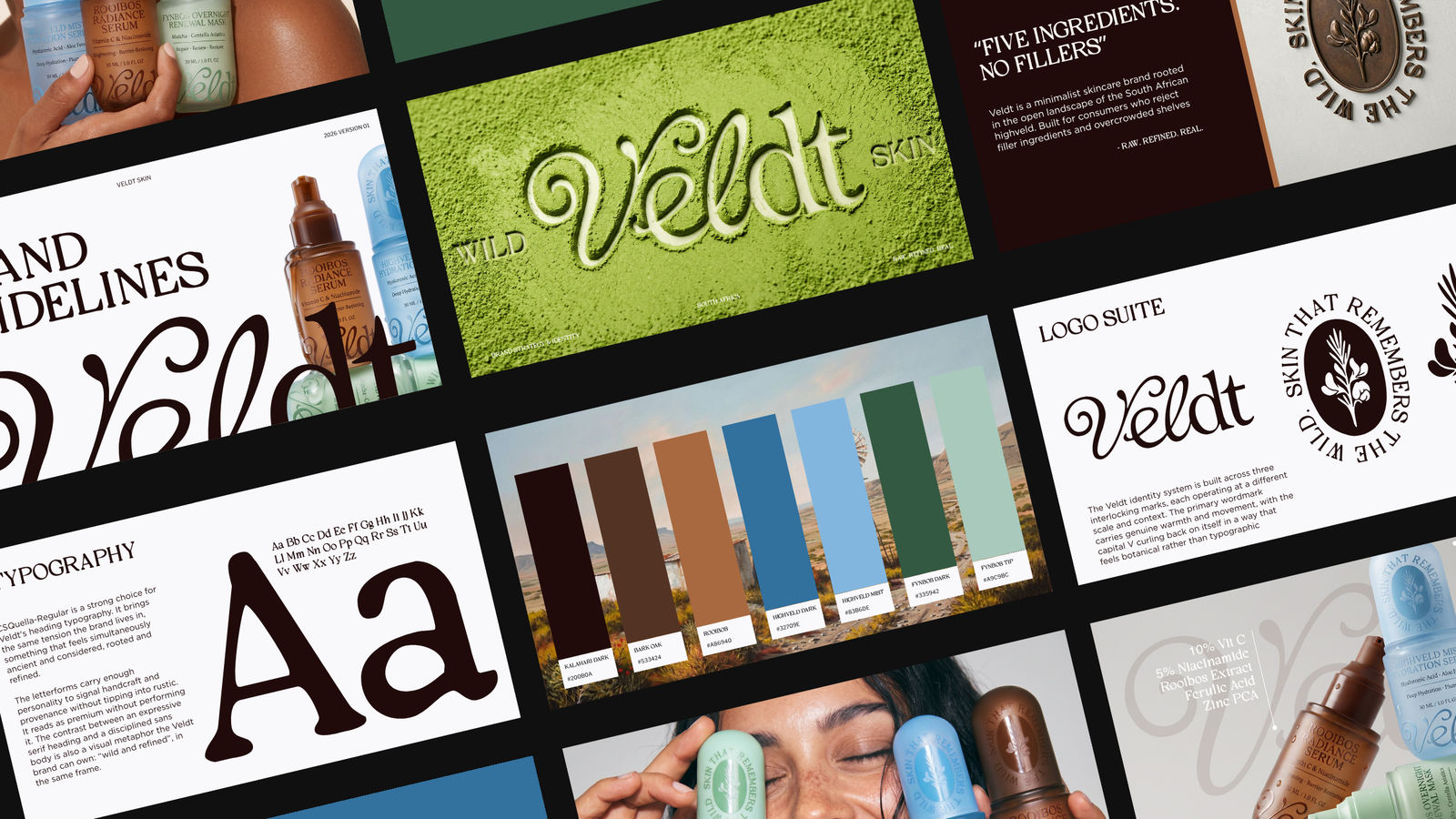
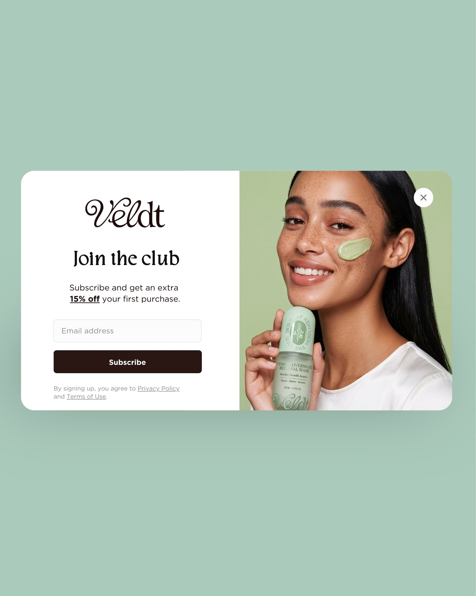
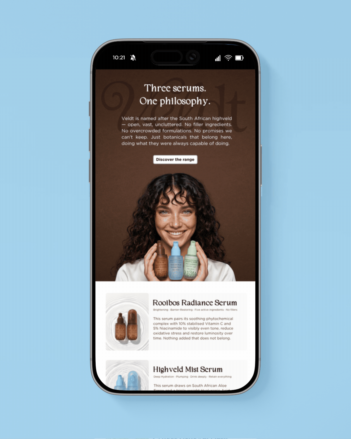
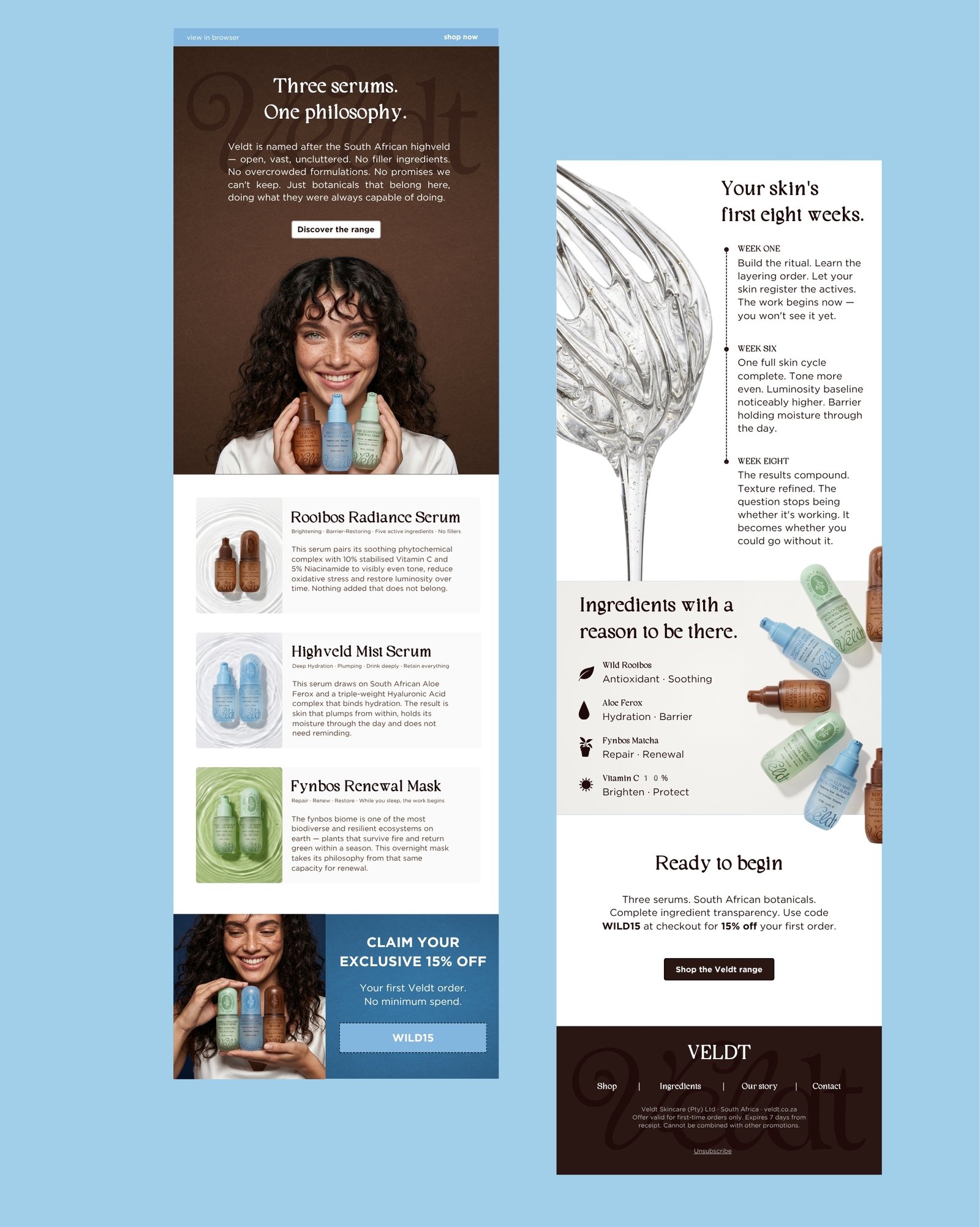
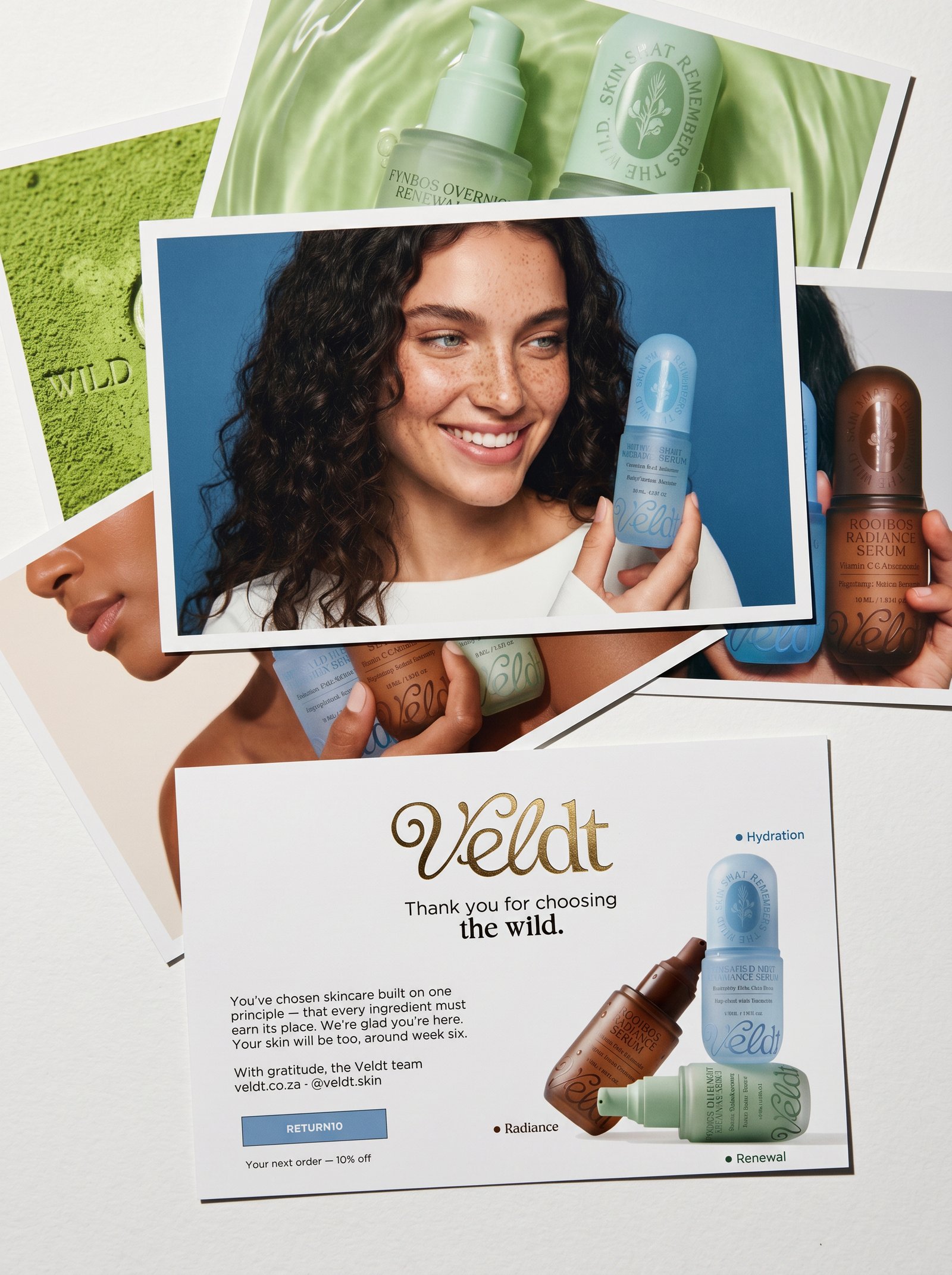
The founders had genuinely good formulations but no visual language, no digital presence and no campaign strategy. The challenge was to build all three simultaneously; identity, web and campaign in a way that felt like a single creative decision rather than three separate projects bolted together.