Pure Velocity Nutrition is a performance supplement brand built around strength, power, and recovery. The identity needed to feel premium and serious enough for committed athletes, while remaining flexible enough to flex into bold, energetic colourways for different product ranges and flavours.
Brand Identity · Logo & Emblem Design · Packaging Design (Tubs, Tubes, Sachets, Bottles) · Colourway Development · Product Photography Direction
A sports nutrition brand needed a strong, athletic visual identity and a flexible packaging system that could scale across multiple product lines, from creatine and preworkout to electrolyte blends and ready to drink bottles, while standing out on shelf and online.
Where many supplement brands rely on generic, interchangeable packaging, PureVelocity Nutrition is built around a single, striking wing and swirl emblem that adapts across a wide range of finishes, from matte black and chrome to holographic pastel, while staying instantly recognisable. Their USP is a flexible identity system strong enough to anchor an expanding product range without losing brand consistency.
The brand needed an identity flexible enough to support multiple product categories and flavour variants, each with its own colour story, while keeping a single, unmistakable visual thread running through every item. The challenge was balancing bold, gym ready energy with the kind of polish that signals genuine quality.
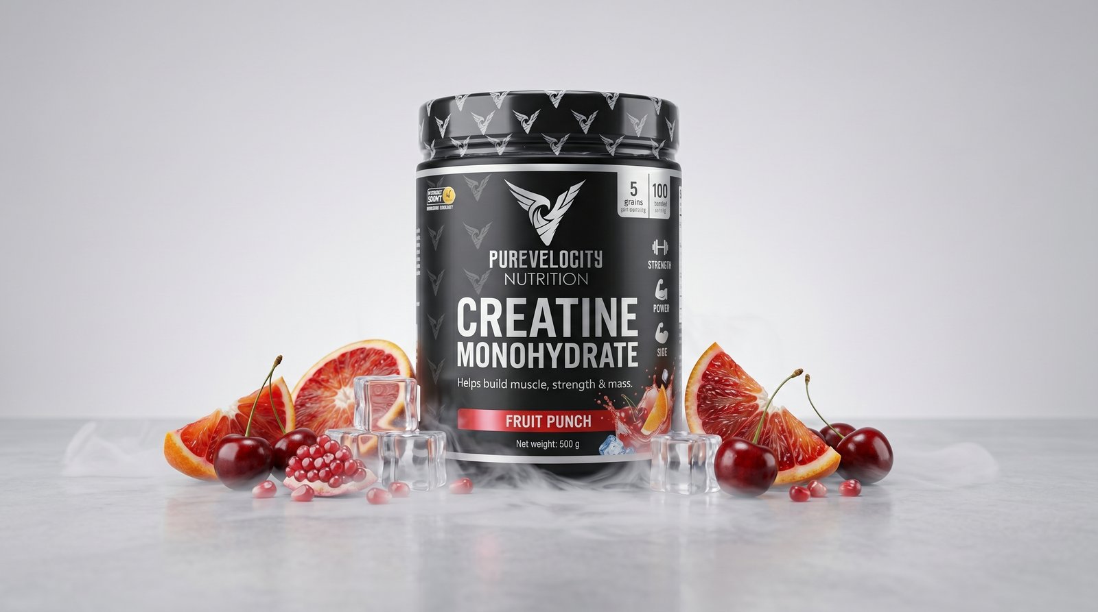
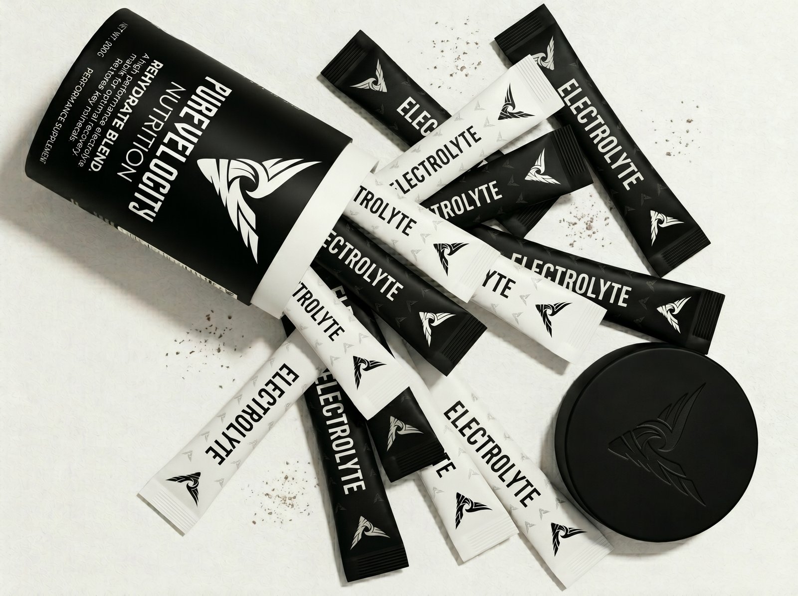
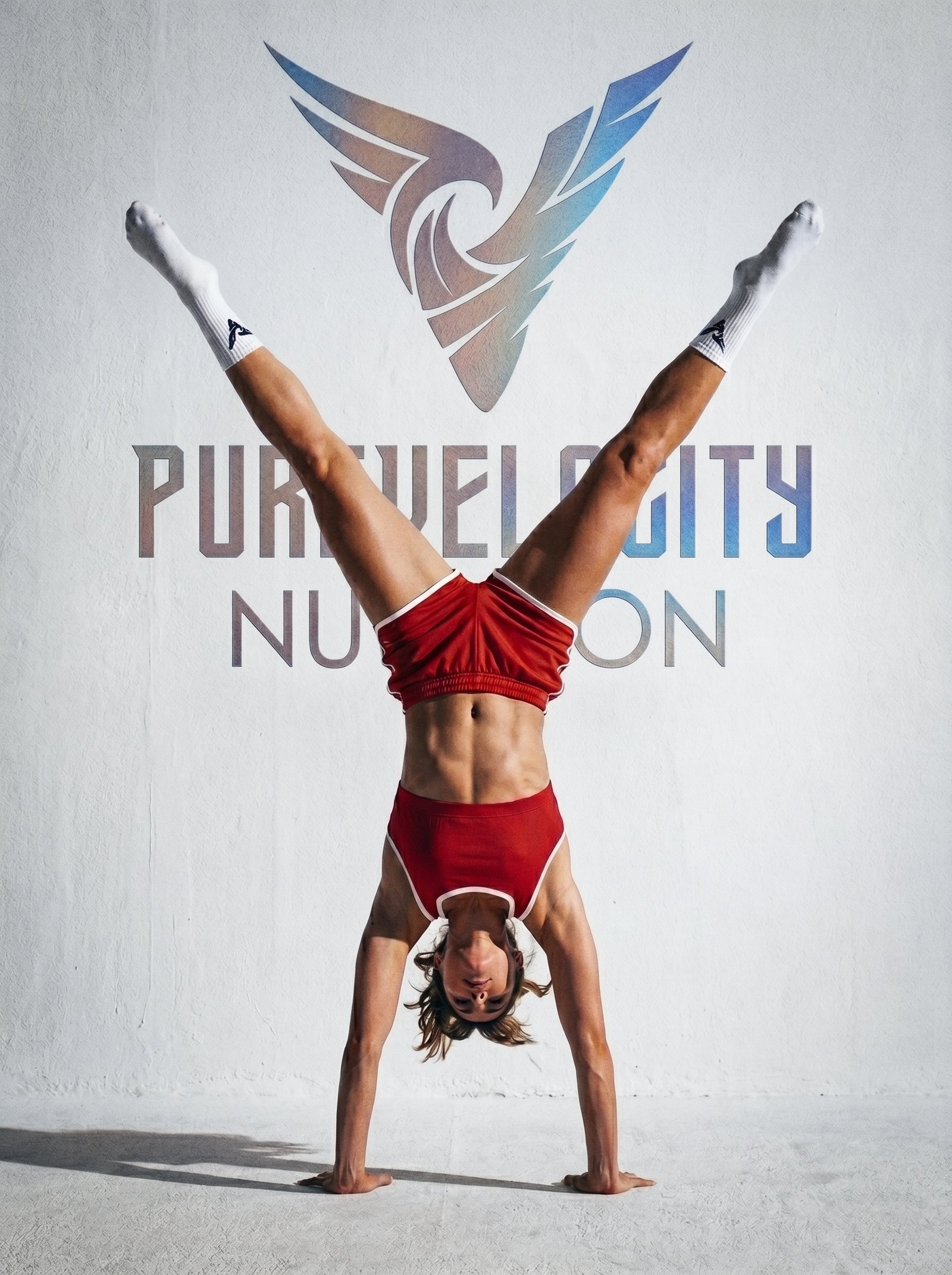
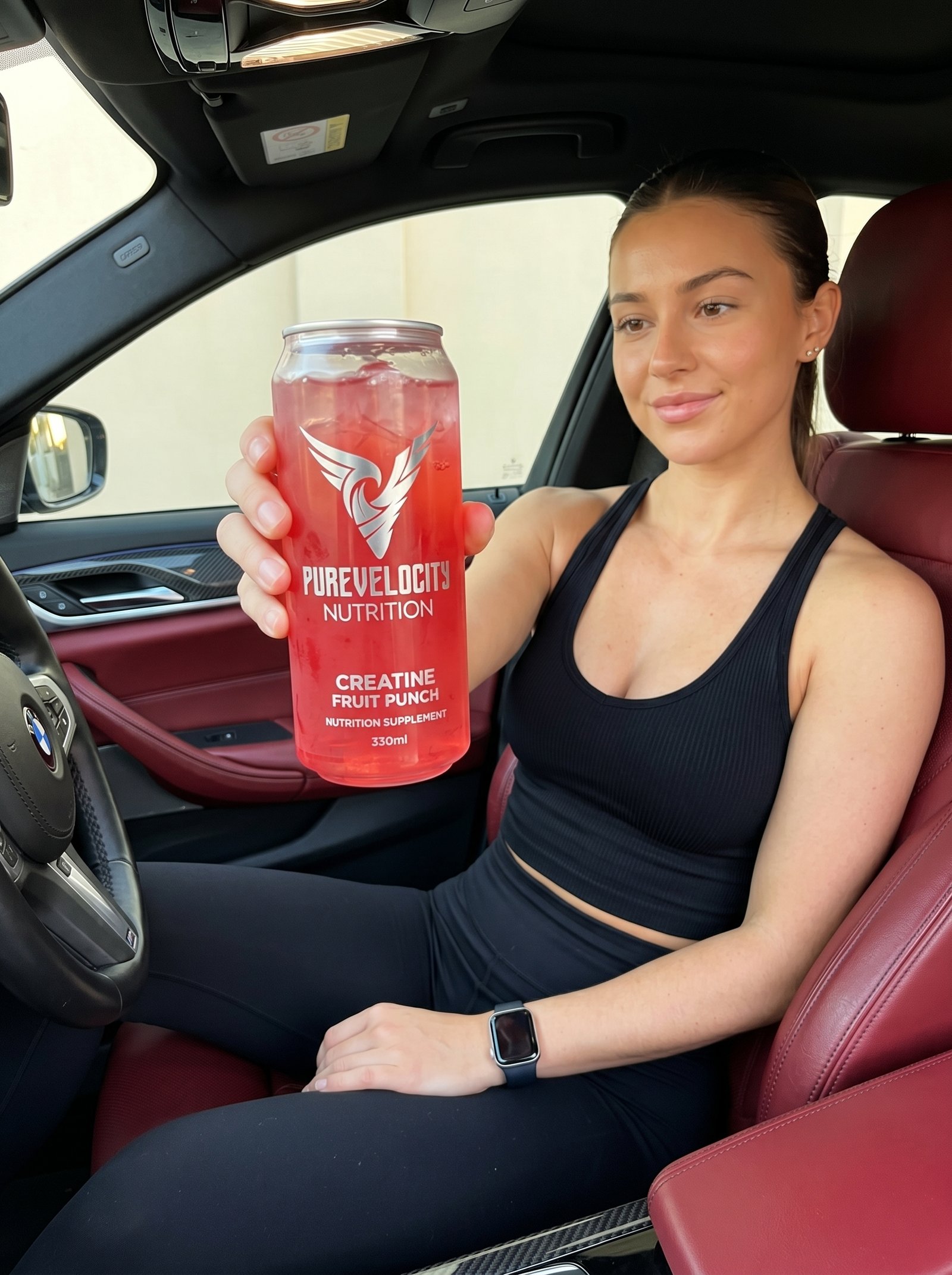
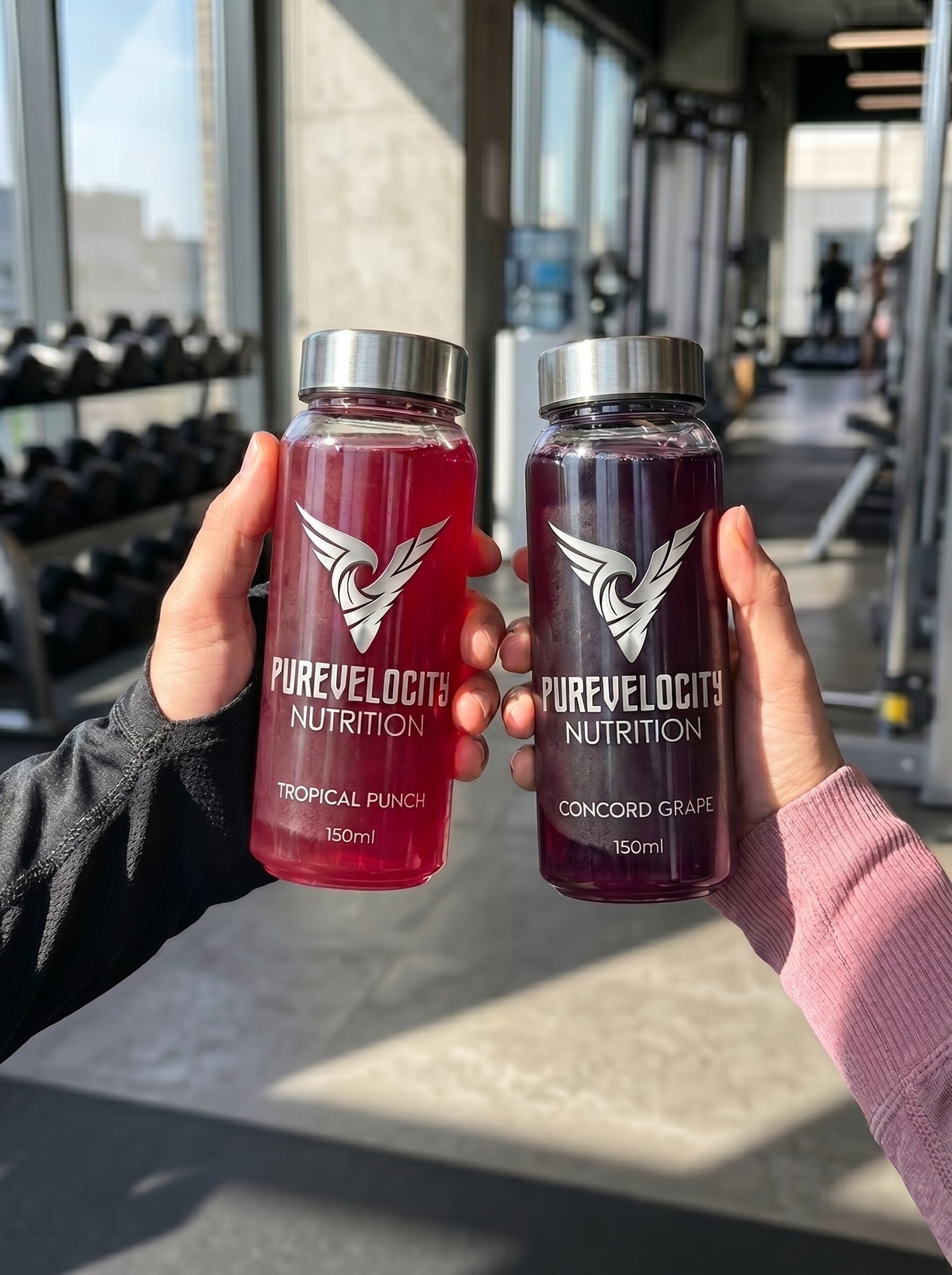
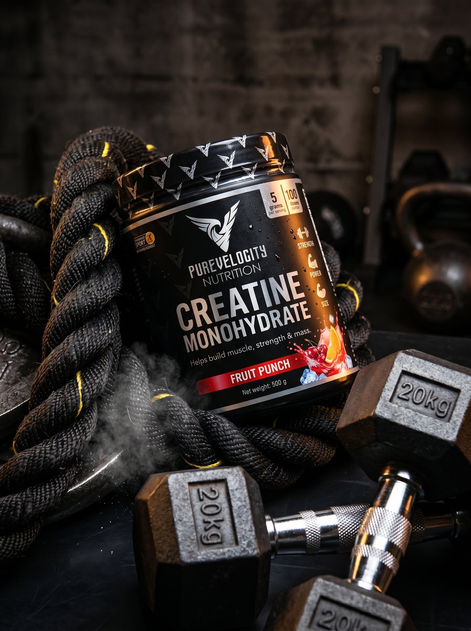
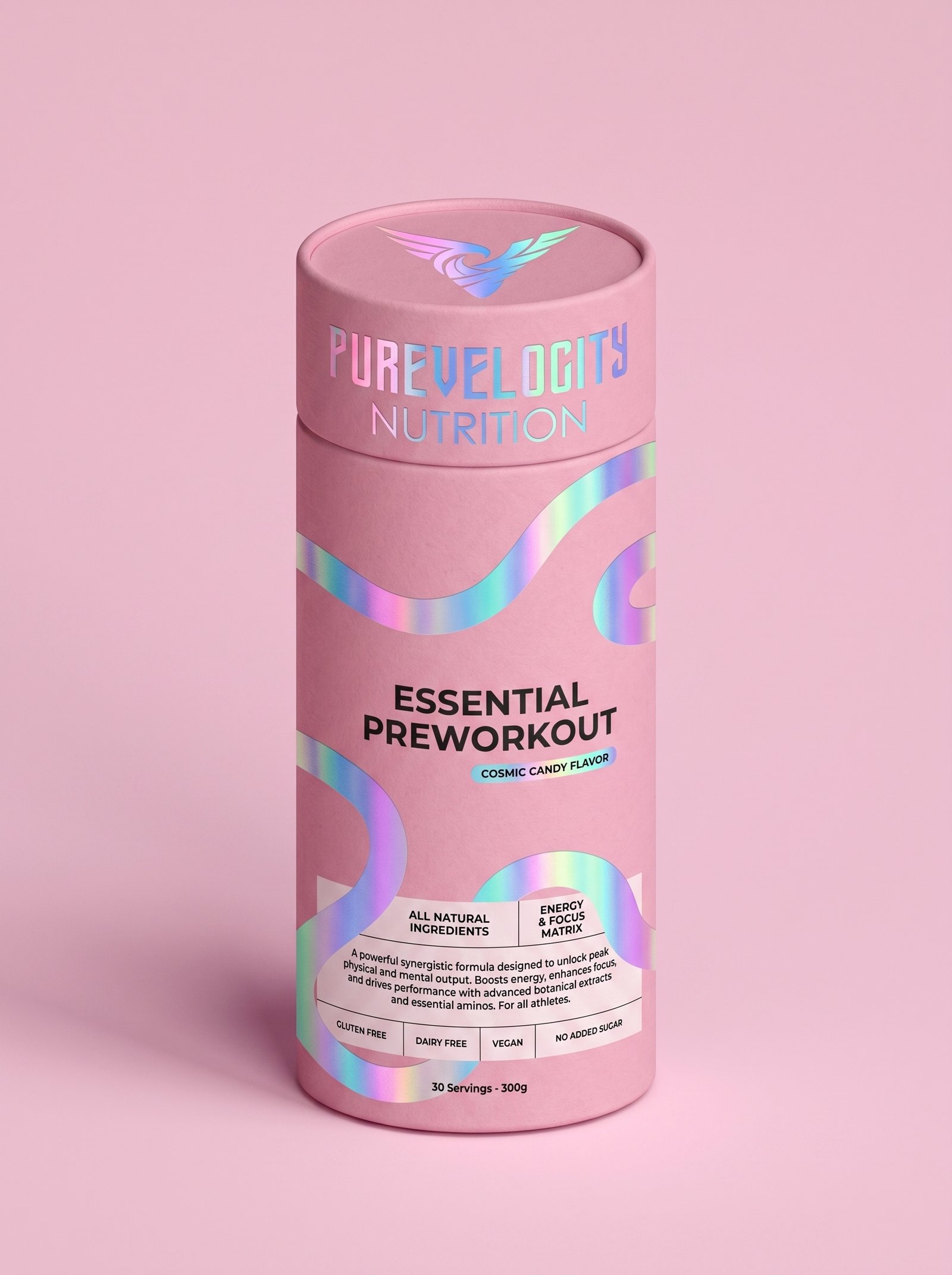
Everything centres on the PureVelocity emblem, a wing wrapped around a swirling V, embossed, foiled, or printed depending on the product. The flagship Creatine Monohydrate range uses a black and silver colourway with a vibrant fruit punch graphic for energy and impact, while a holographic pastel variant of the same product offers a lighter, "fuel your flow" alternative. The Essential Preworkout line shifts into a soft pink and holographic palette for its Cosmic Candy flavour, while the Rehydrate electrolyte blend uses a clean black and white sachet system with the emblem repeated as a subtle pattern. Ready to drink bottles carry the logo boldly across vibrant fruit coloured liquids, designed to photograph well in real gym settings. Across every format, the goal is the same: one identity, instantly recognisable, flexed across colour, finish and product type.