Mathews With One T Consultancy helps professionals navigate change, take ownership of their career journeys, and make confident moves forward through strategic planning, self discovery, and practical tools. The brand needed an identity that reflected clarity and authority while making the “One T” detail an asset rather than an oddity.
Brand Strategy · Logo System · Colour & Type · Pattern Design · Brand Guidelines · Stationery & Print Collateral · Signage & Wall Applications · Logo Reveal Animation · Brand Application Mockups
A career coach and strategist needed a brand identity that captured his personality, professional authority, and the distinctive nature of his consultancy's name, "With One T", in a way that felt clean, clever and memorable.
Where most consultancies lean on generic corporate branding, Mathews With One T built its identity around a single, memorable quirk: the founder's name. Their USP is turning that small detail into a visual hook, using spacing and alignment to make the "T" a hero element across the entire brand system.
The founder had a strong personal voice and a clear vision, but no visual system to express it. The challenge was to create an identity bold enough to feel personal and ownable, yet clean and professional enough to build trust with corporate clients seeking career guidance.
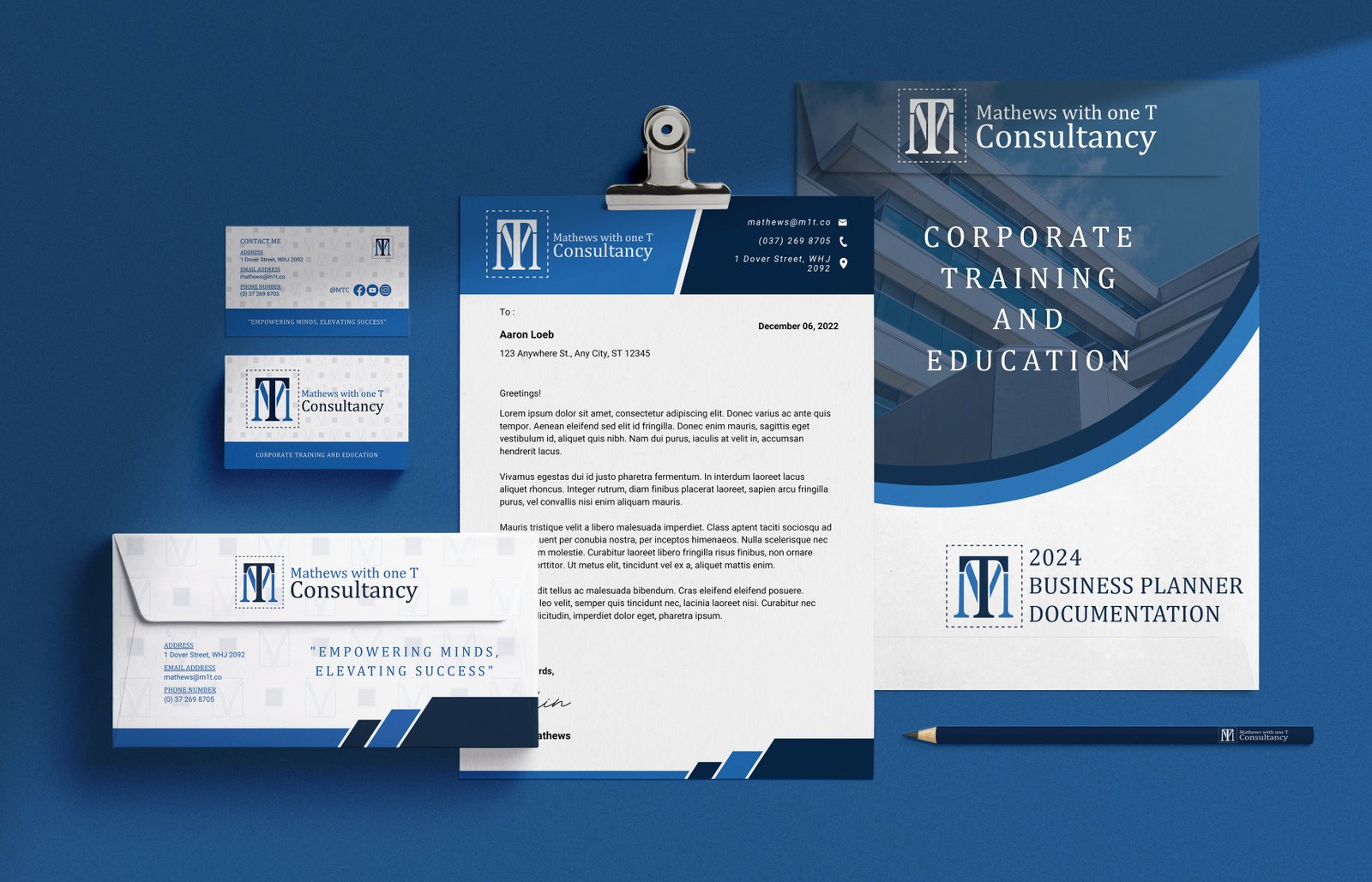
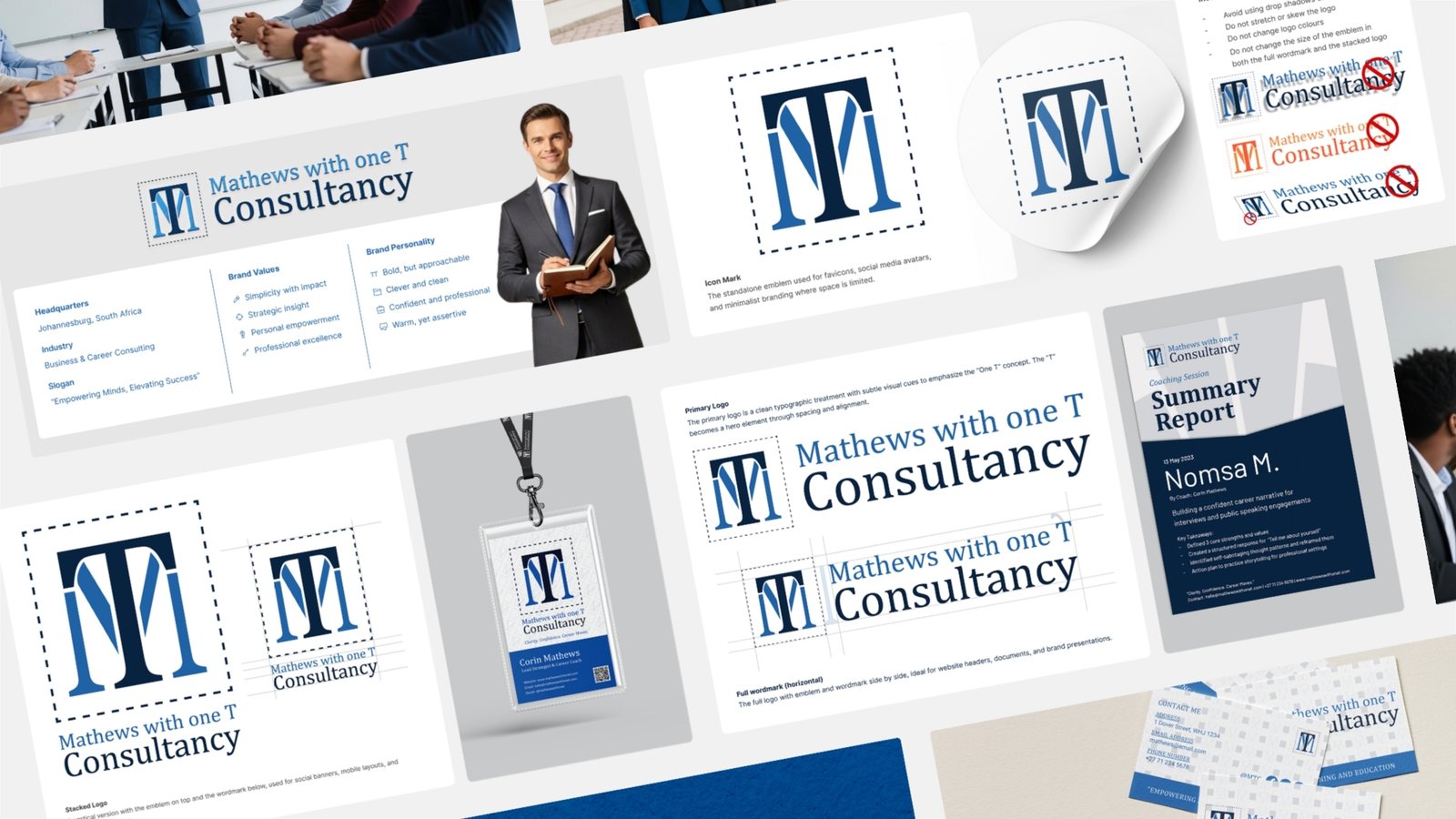
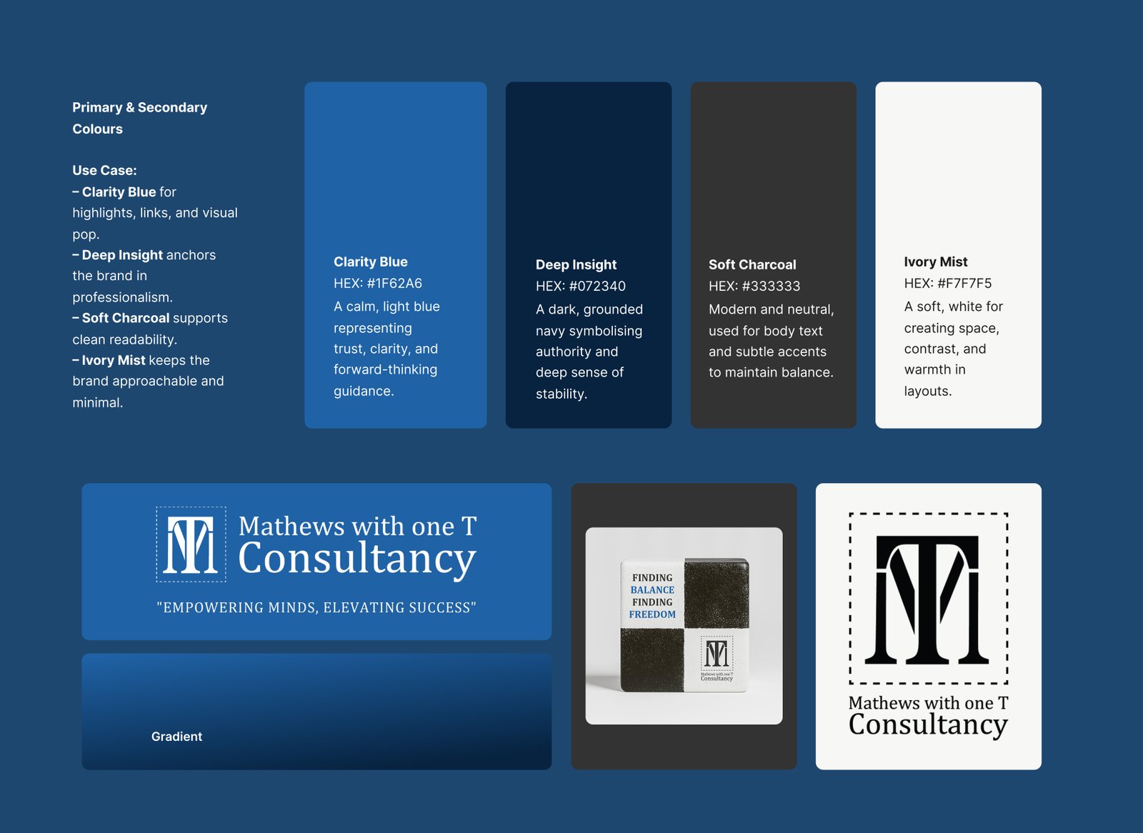
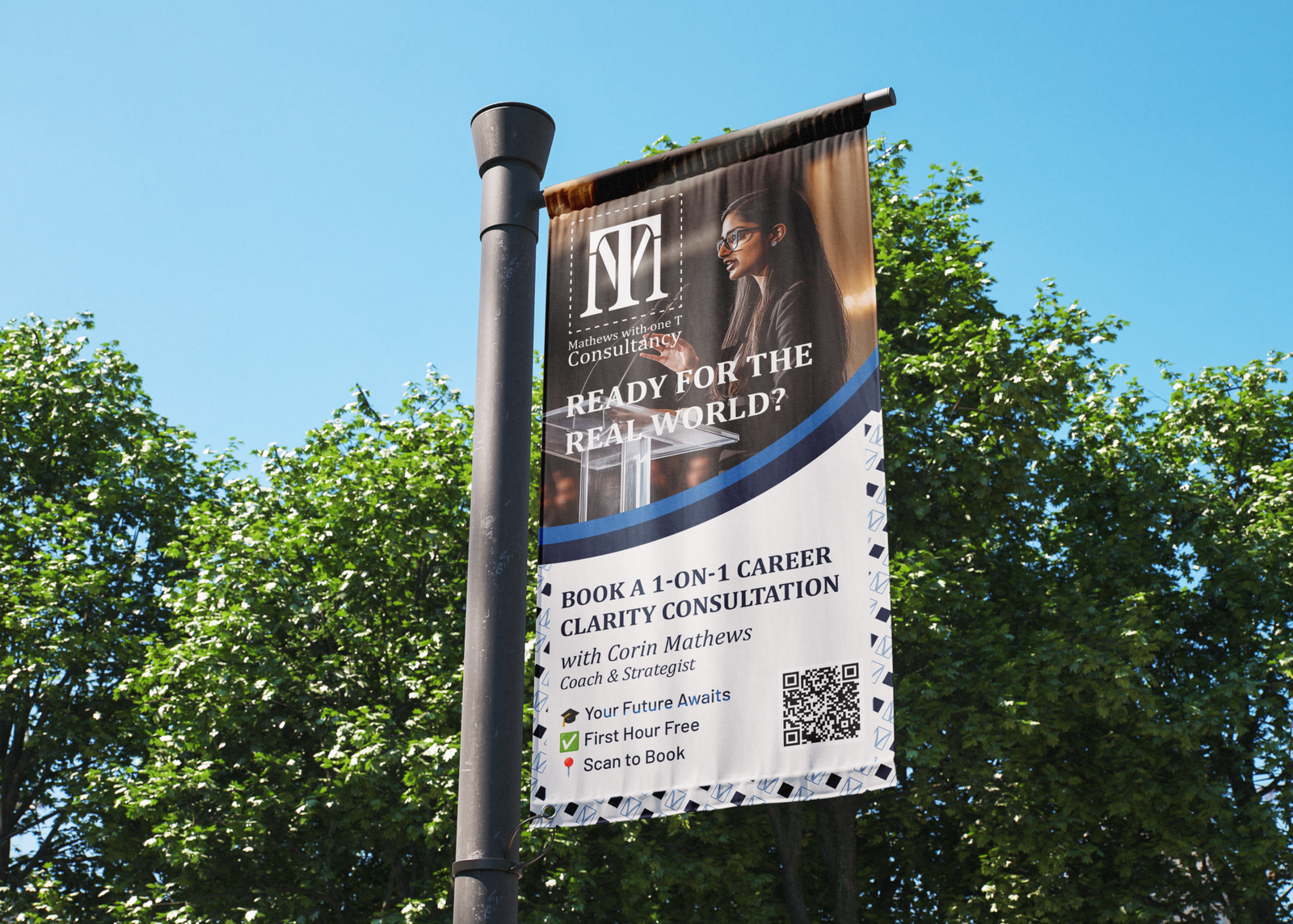
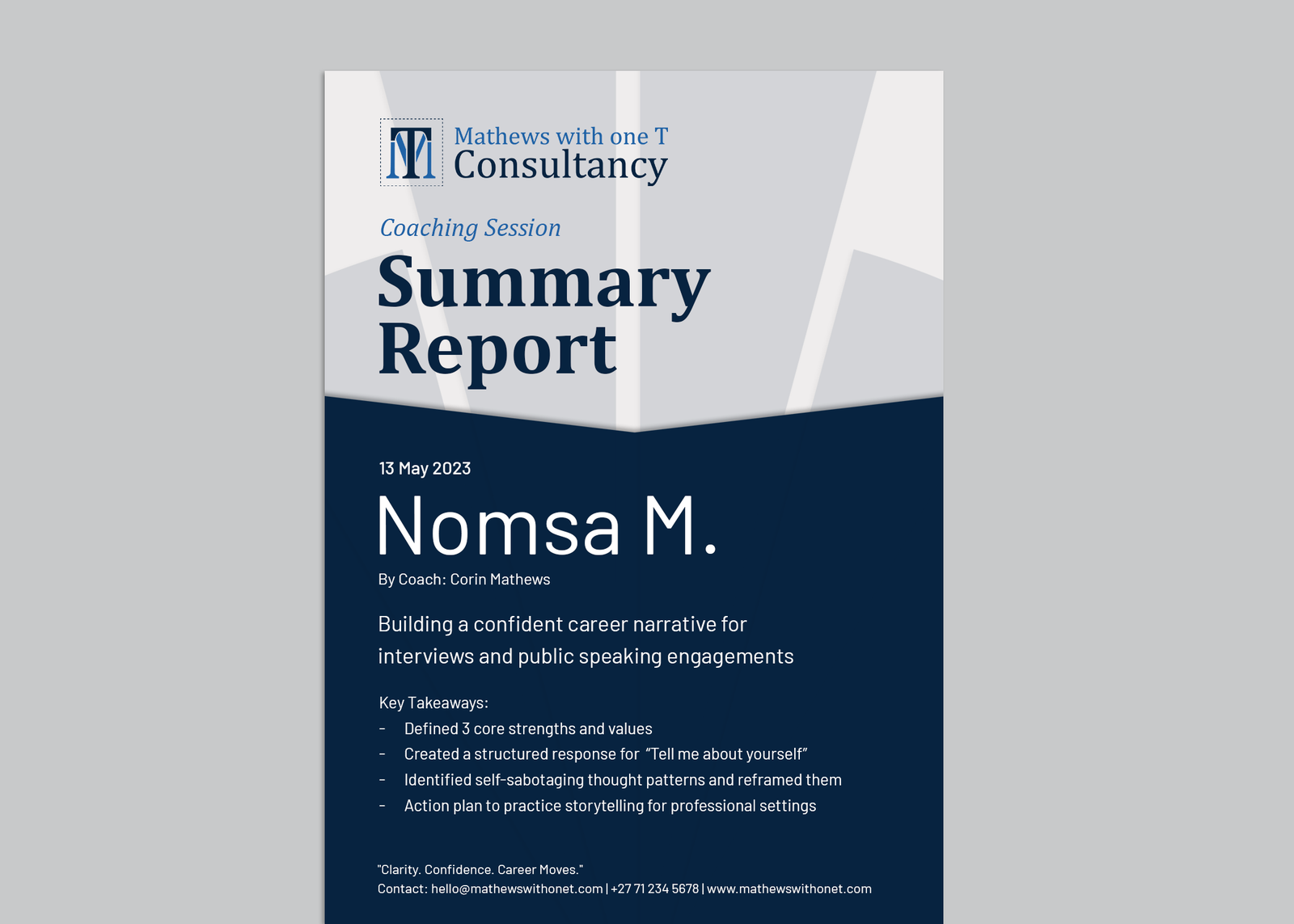
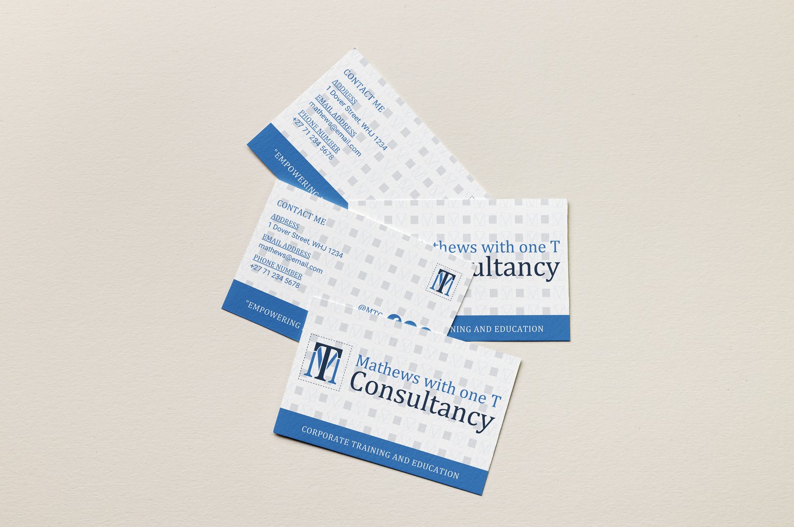
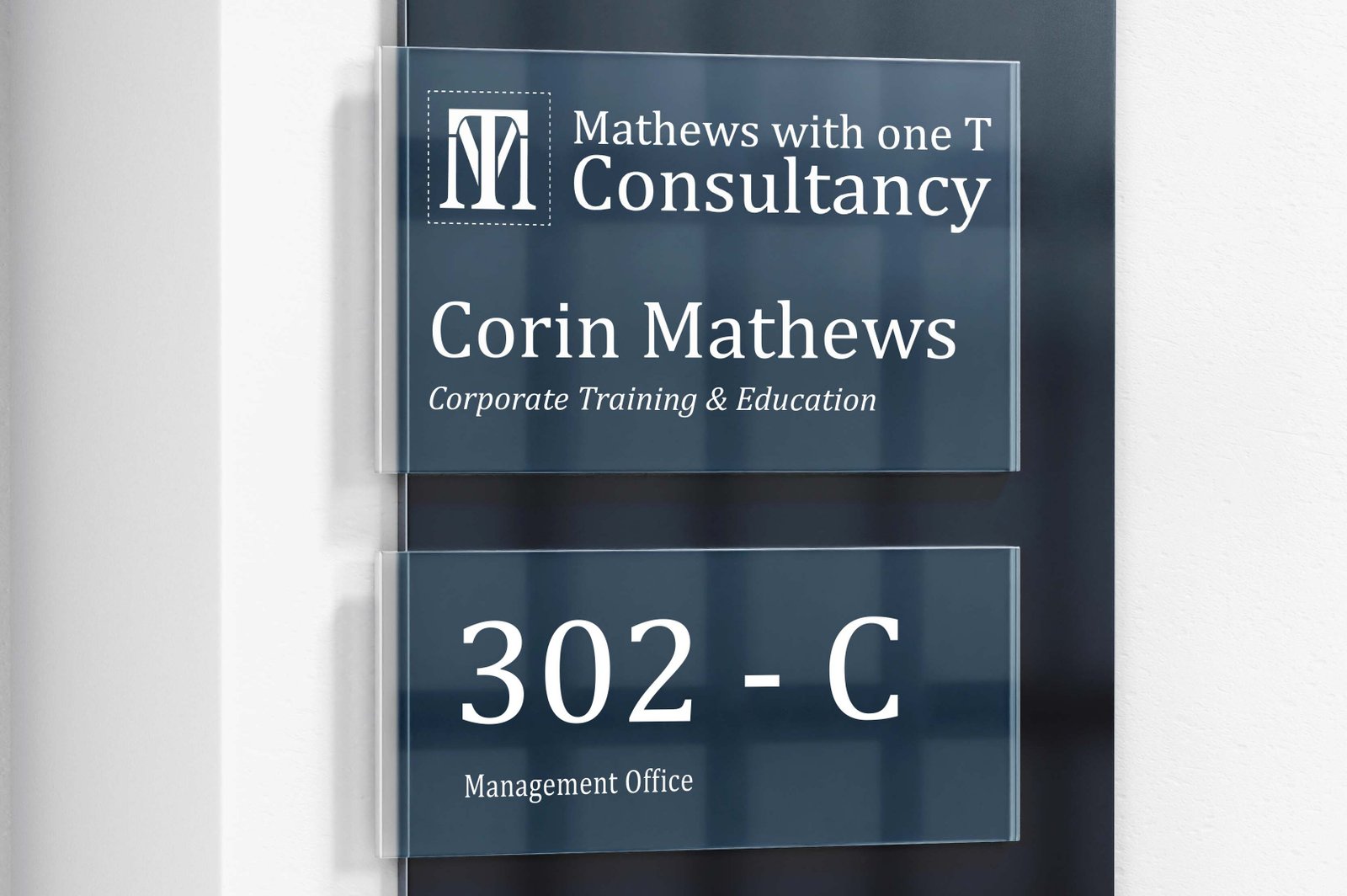
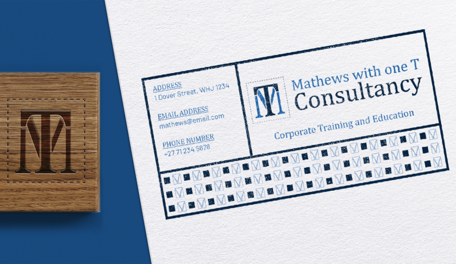
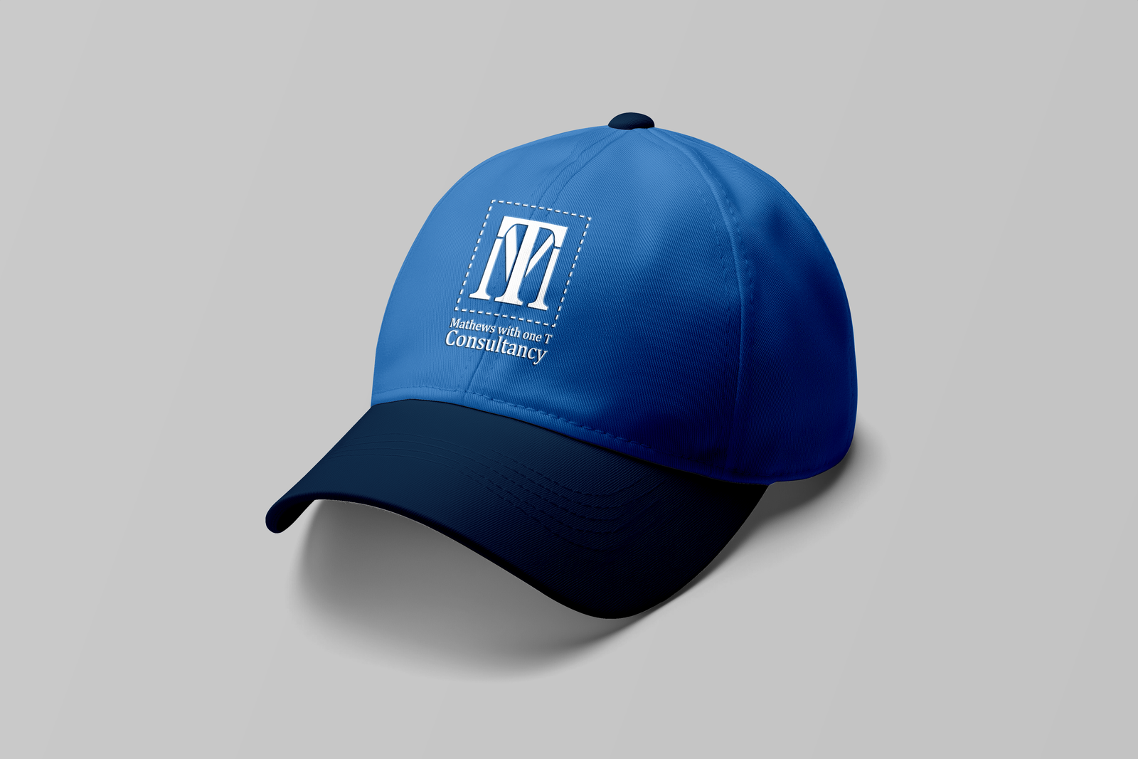
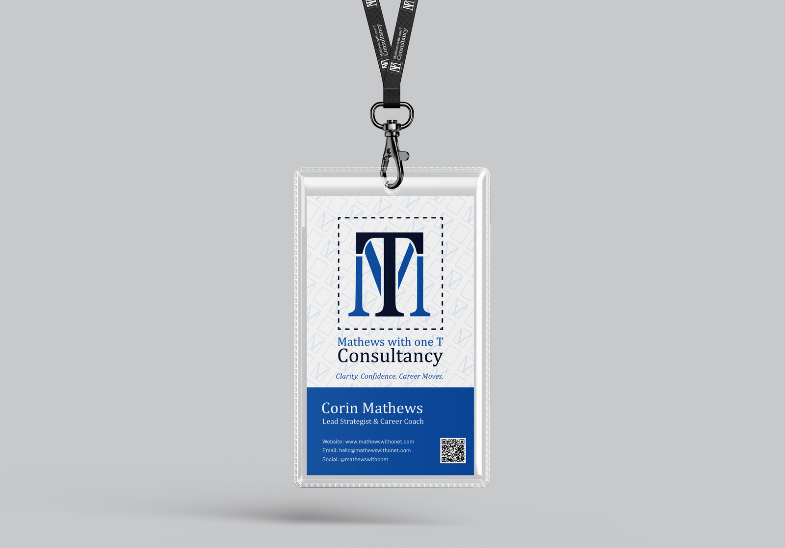
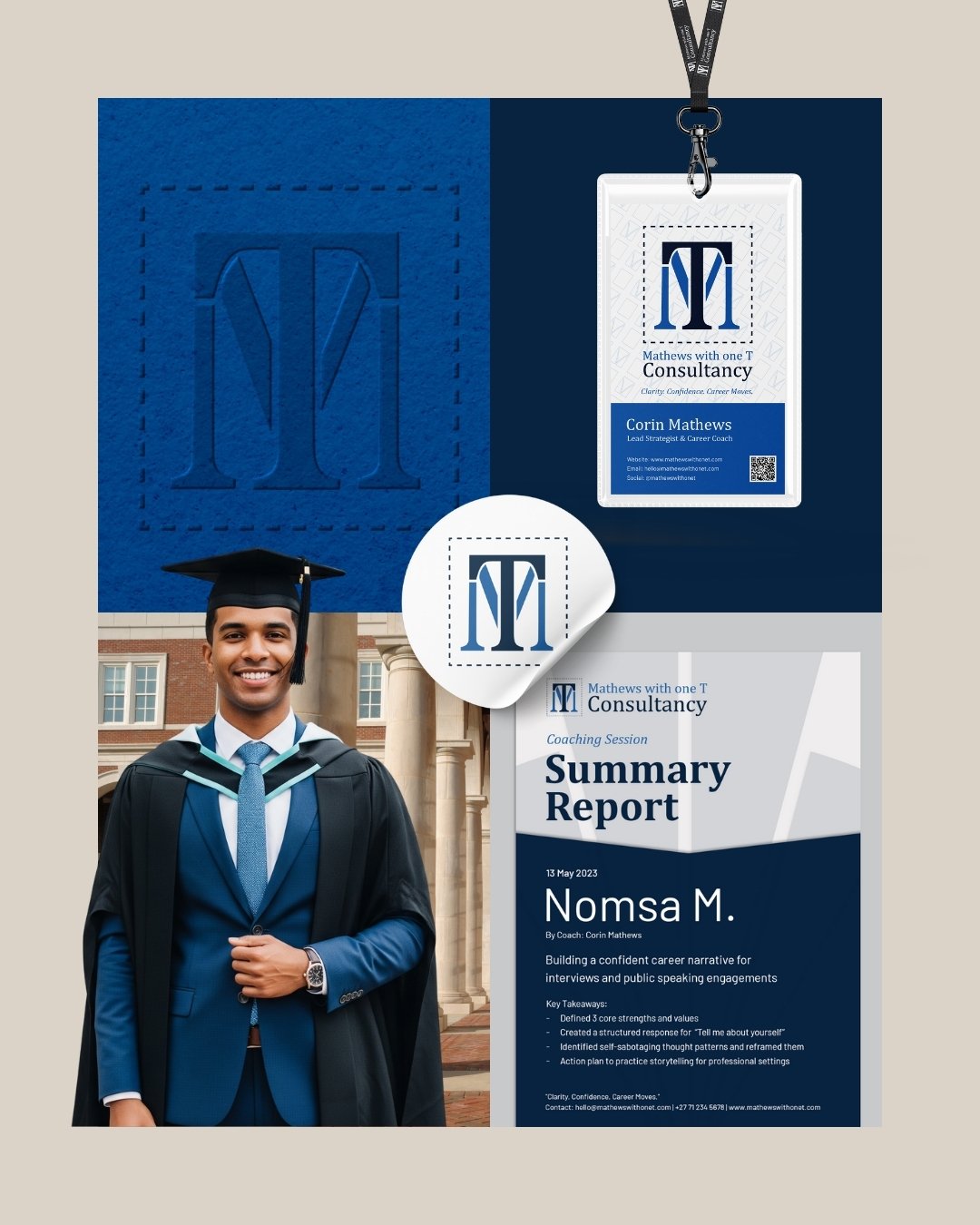
Every decision started with the name itself. "With One T" became the foundation of the logo system, with spacing and alignment used to draw the eye to the single "T" as a quiet signature detail. Cambria brought elegance and authority to headings, paired with Barlow for clean, approachable body copy. The colour palette of Clarity Blue and Deep Insight grounded the brand in trust and stability, while Soft Charcoal and Ivory Mist kept layouts minimal and legible. A custom illustrated pattern extended the identity across stationery, signage, and digital applications, ensuring the brand felt cohesive everywhere it appeared.