La Kova is a drinkable immunity supplement brand targeting high-performance, health-conscious 22–35 year olds. They needed a market-defining identity, a complete packaging system and a launch campaign capable of earning placement at premium wellness retailers, gyms and event partnerships across the UK, USA and South Africa.
Brand Strategy · Naming Architecture · SKU Naming System · Logo System · Colour Architecture · Typography System · Packaging Design — All 6 SKUs · Pack Format Architecture — 7 Pack Formats · Brand Guidelines · 3-Market Copy Strategy · Campaign Concept · Social Content System · Instagram Grid Architecture · Story Templates · LinkedIn Banner · Flow AI Photography Brief — 84 Prompts · Event & Festival Creative · Collab Pack Design Framework
La Kova is a drinkable immunity brand built for the generation that trains before work, tracks their HRV, reads ingredient labels and refuses to compromise on either performance or quality. Six SKUs, each a complete product world; its own liquid colour, metallic cap, clinical formula and tagline all unified by a single iridescent brand system that travels across three continents without alteration. The brand had to feel premium in a London pharmacy, credible in a New York wellness store and bold on a Johannesburg gym counter. Same packaging. Same logo.
The USP is the combination of pharmaceutical-grade ingredients and a visual identity bold enough to sit on a festival bar counter or a gym reception desk and stop people mid-stride.
The founders had a strong product concept and genuine clinical formulations but no visual language, no brand name rationale and no campaign strategy. The challenge was to build identity, packaging and campaign simultaneously for, three culturally distinct markets, in a way that felt like a single creative decision rather than three separate executions bolted together. Every design choice had to earn its place in London, New York and Cape Town before a single word of copy was read.
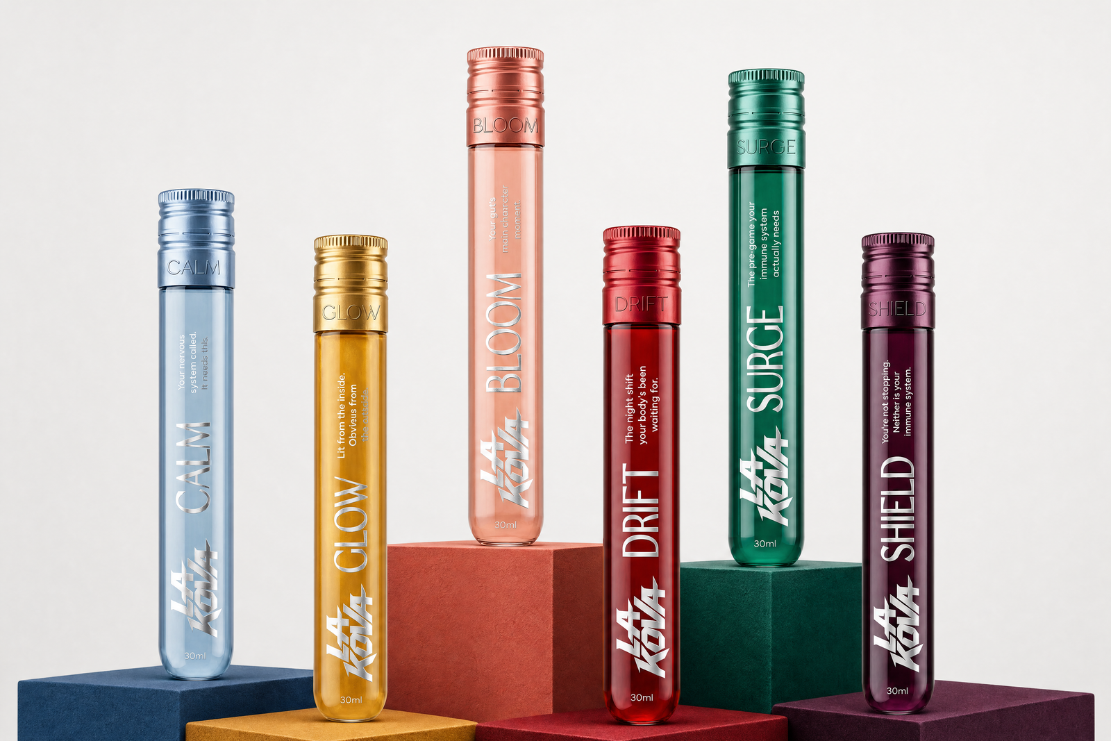
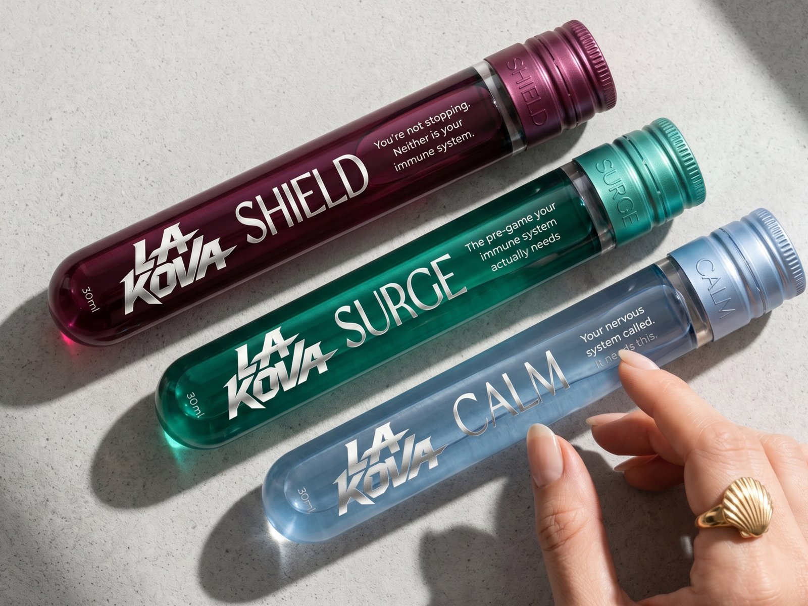
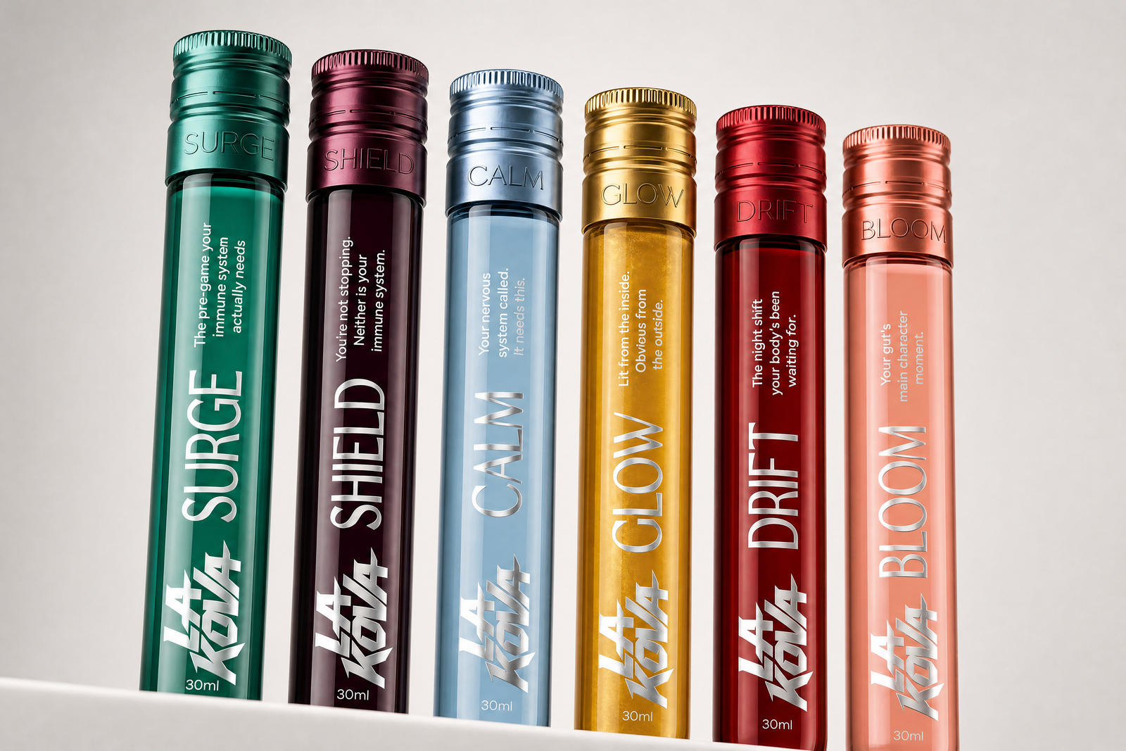
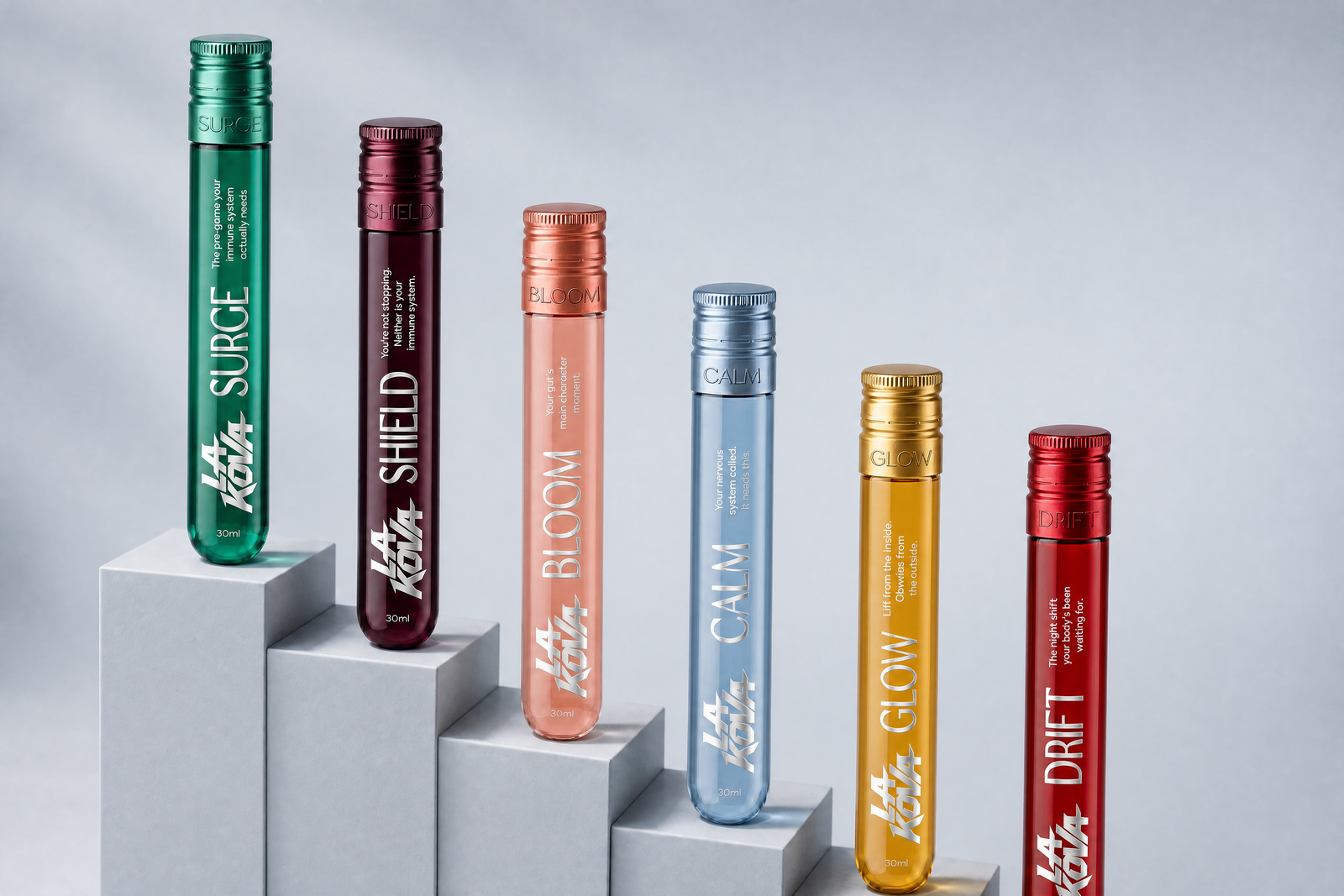
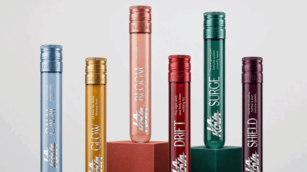
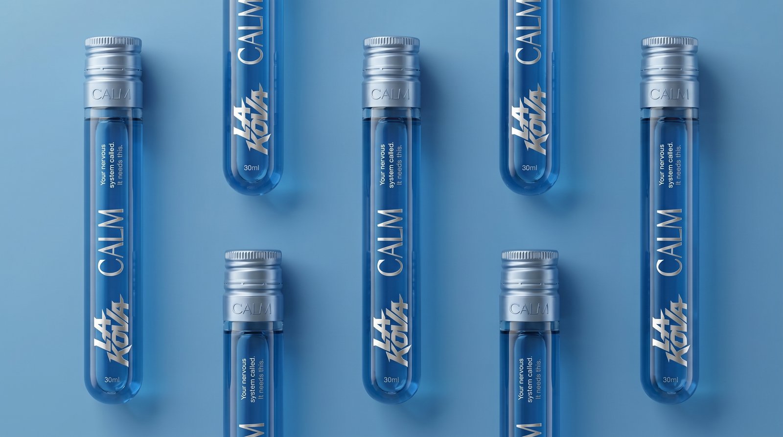
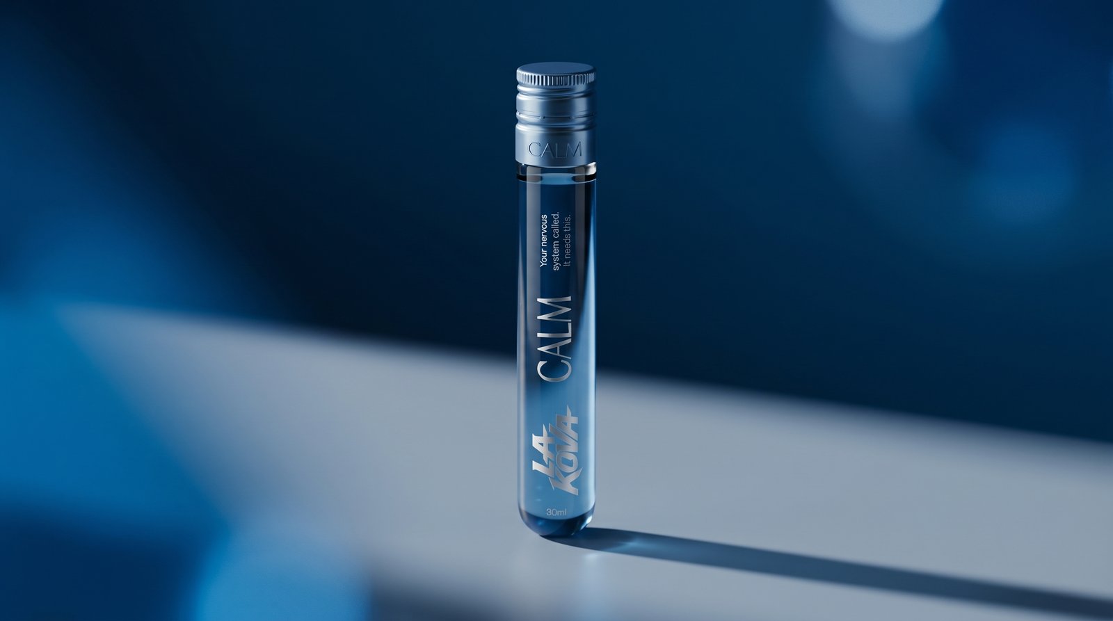
Every decision started with the product needing to feel intentional, premium and repeatable. The six SKU names were written as single-word action states: Shield, Surge, Calm, Bloom, Glow and Drift. Each is a feeling, not a description. The pack architecture was built around three commercial entry points:
1. The Drop (impulse, single dose),
2. The Week (7-day protocol),
3. The Stack (full collection)
each designed to serve a different purchasing moment without fragmenting the visual system.