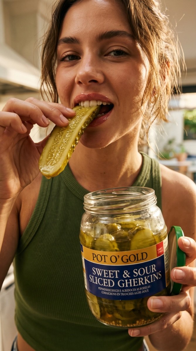
Hear thecrunch.
I started with
the jar.
Reposition Pot O’ Gold Sweet & Sour Sliced Gherkins as a culturally relevant, desirable food brand.
Pot O’ Gold had a place on the shelf, but I couldn’t find a brand presence beyond it. I saw an opportunity to give it a distinctive look and connect it with a younger audience. That became the starting point for this campaign.
A recognisable supermarket product.
No established campaign world to inherit.
A new creative direction, brought to life through an AI image campaign.
Four ways to see the same jar.
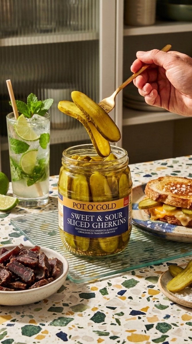
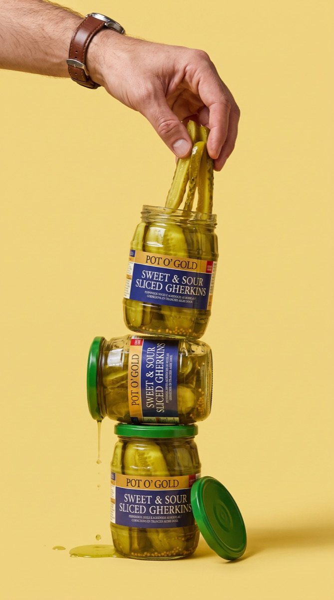
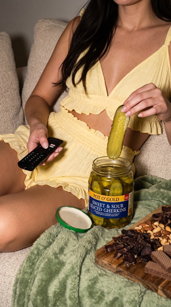
People, food, product and occasion. Each image has a different job, but the same light, palette and unmistakable long slice.
Food with a point of view.
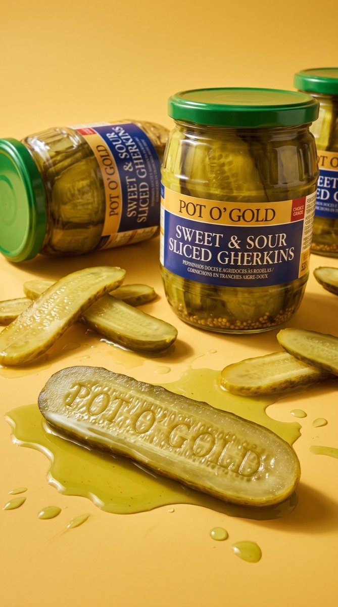
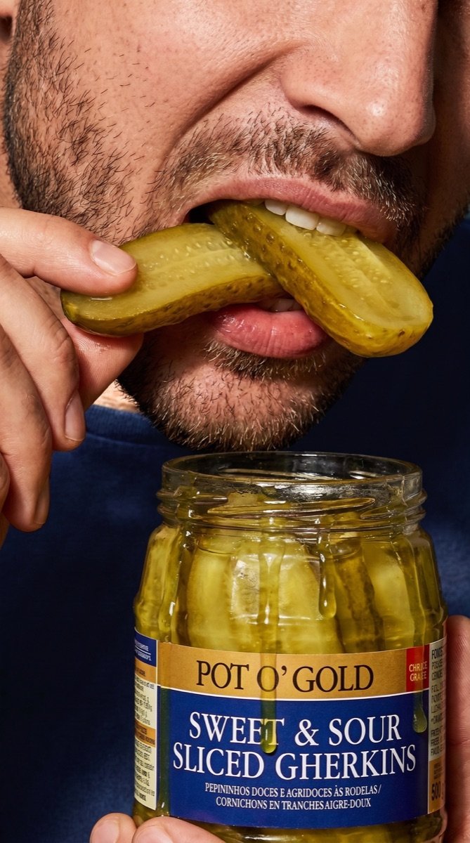
Warm directional sunlight, strong natural shadows, oblique angles and close-up texture give the images the finish of a food and fashion editorial.
Molten cheese, glossy brine, crumbs and coarse salt make the food worth looking at. Clothing, ceramics, paper napkins and glassware repeat the palette without turning the set into a showroom.
Product fidelity
The label faces the camera. Gherkins remain thin, flat lengthwise slices, never round coins.
Human energy
Hands reach, people bite, food is served. The scenes feel inhabited rather than arranged for a catalogue.
#183A31#EEDB88#FFFAF2#203451#AA8145The image collection.
Twelve final 9:16 photographs. The crops here show how they can work in a campaign layout; select any image to see its full portrait frame.
I developed the strategy, defined the creative direction and brought Pot O’ Gold to life through an AI image campaign.
A feed with its own visual rhythm.
A nine-tile launch look: portraits, food and product imagery punctuated by a few simple type-led posts. The jar and slice shapes become graphic devices.
Sweet.
Pot O’ GoldSour.
Sliced.
Lunch, with more crunch.
The food editHear the crunch.
Campaign lineLong slices.
Product detailReal texture.